 Ilies Allali
From Swoop to Mute, four years building a brand
Sole designer of the brand for four years, from the startup winning competitions to the company that industrialises.
Mute Energy, still called Swoop back then, builds silent mobile power stations from second-life electric vehicle batteries. I arrived in 2022 with an identity already in place, which I first touched up, then audited and completely rebuilt at the end of 2023.
- as the brand’s sole designer
- 4 years
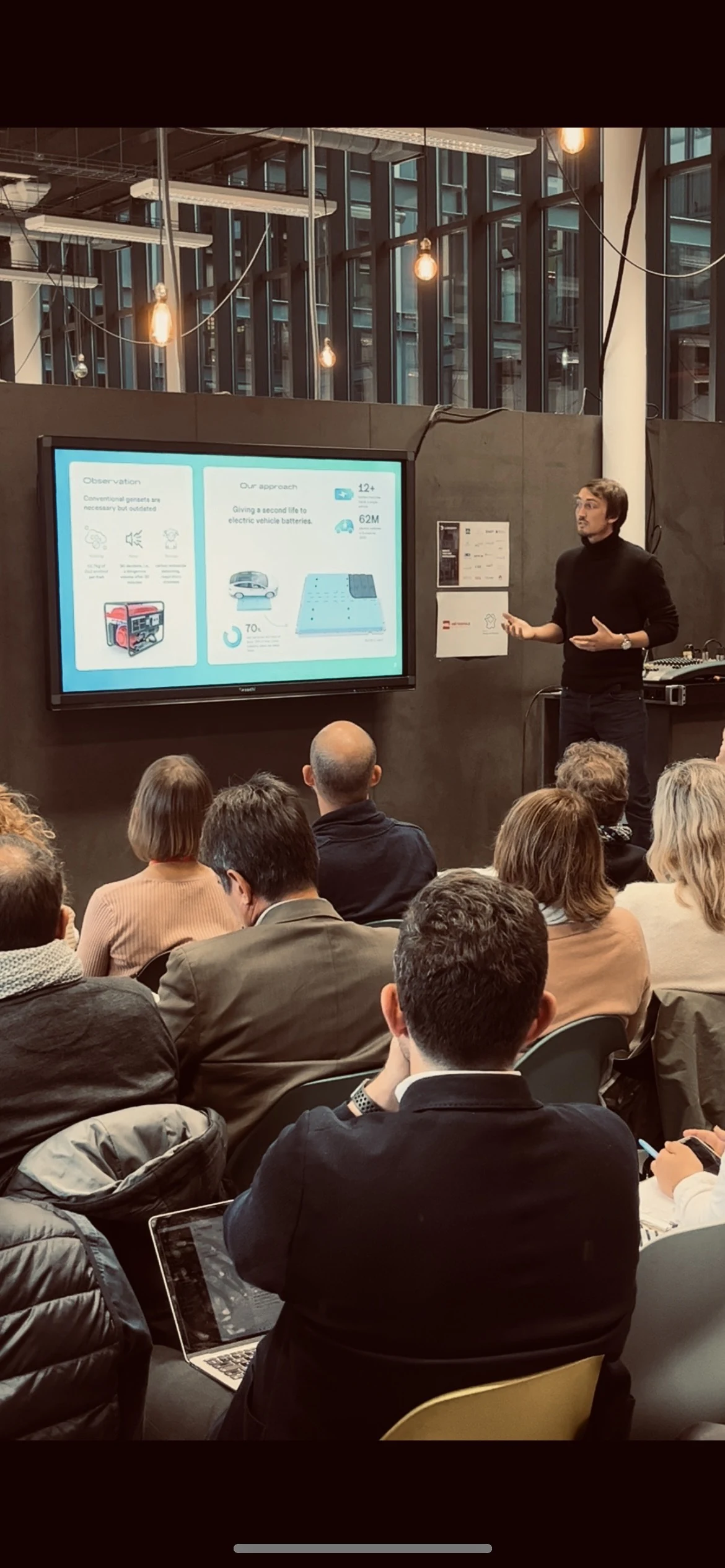
- decks, from competitions to investors
- 100+
- ECHO-5 on the market under the new brand
- 2025
From competitions to urgency
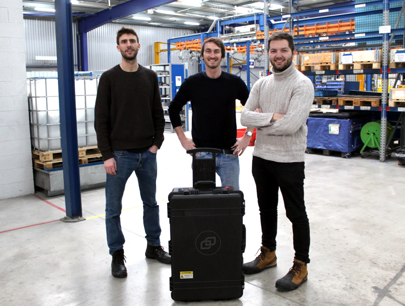
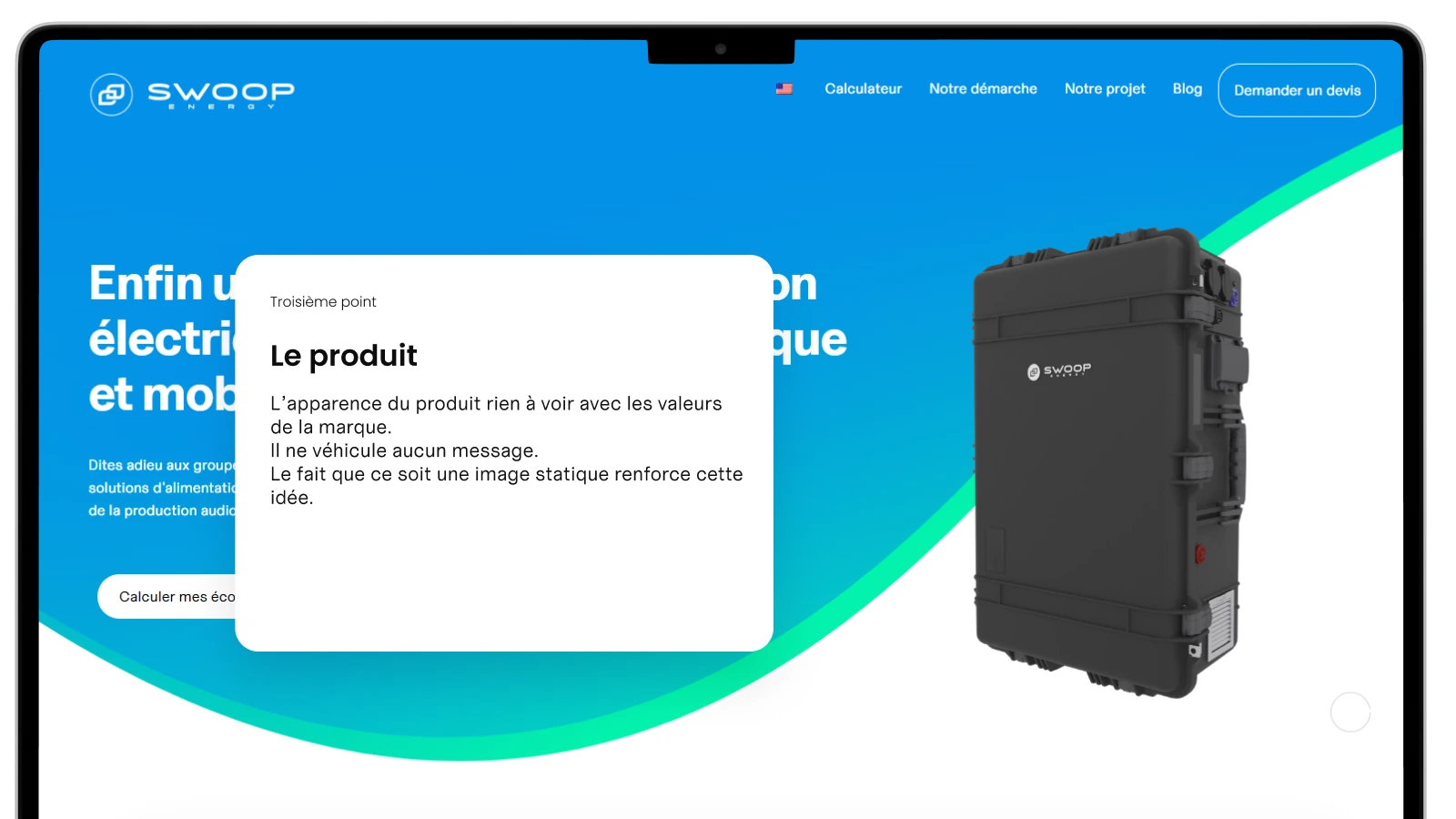
At first, Swoop funded itself by winning competitions, and my first projects as a work-study designer were the decks for those competitions. At the end of 2022, a request for generators for craftsmen rebuilding in Ukraine shifted the product to reconditioned batteries in a military case. I learned Blender to show it in context and turned out renders, decks, stickers and site updates, except that a military case says very little about what the brand sells.
A grid before the verdict
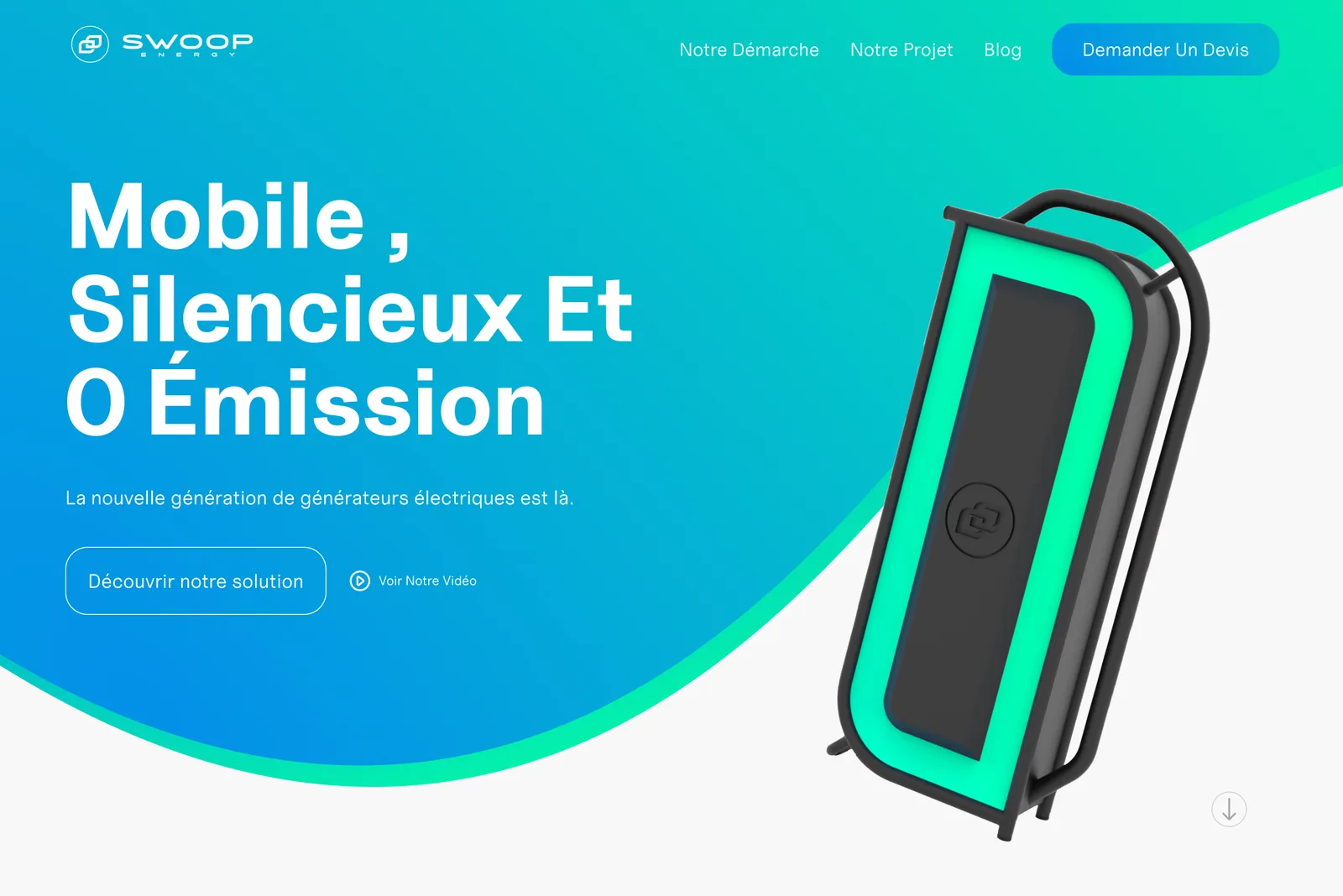
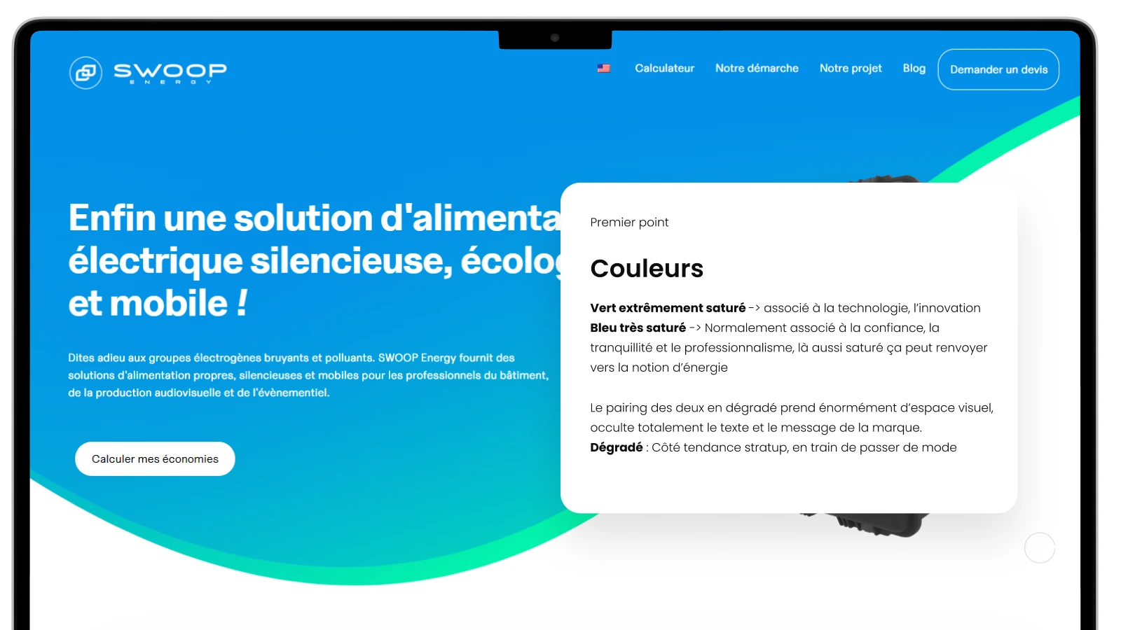
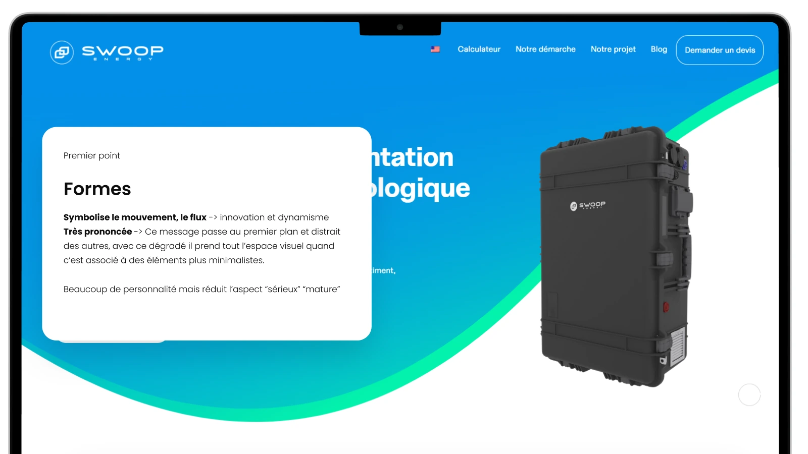
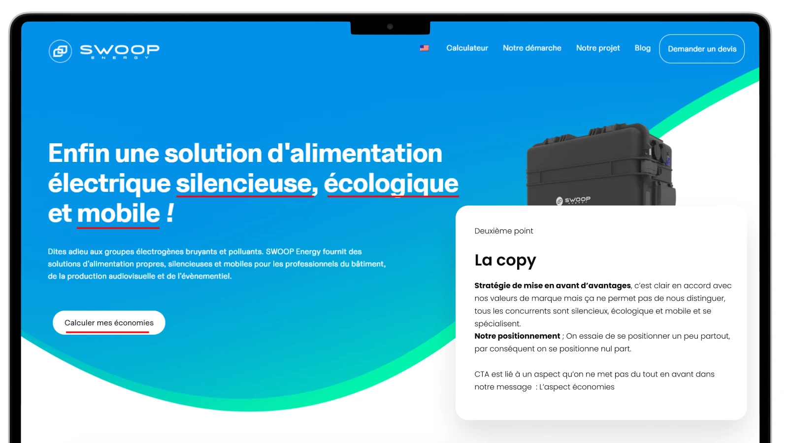
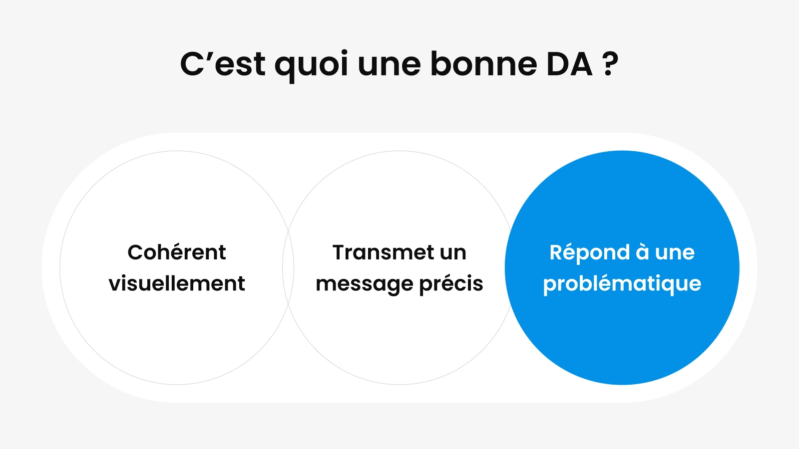
At the end of 2023, I started the audit with a grid, good art direction is consistent, carries a precise message and answers a problem, and only then applied it to what existed. The saturated gradients ate up the space, the wave crushed everything else, and the copy promised silence and ecology like every competitor. I had to step back a long way, because the identity I was critiquing was the one I had made, and it was no longer what the brand needed.
Silence rather than green
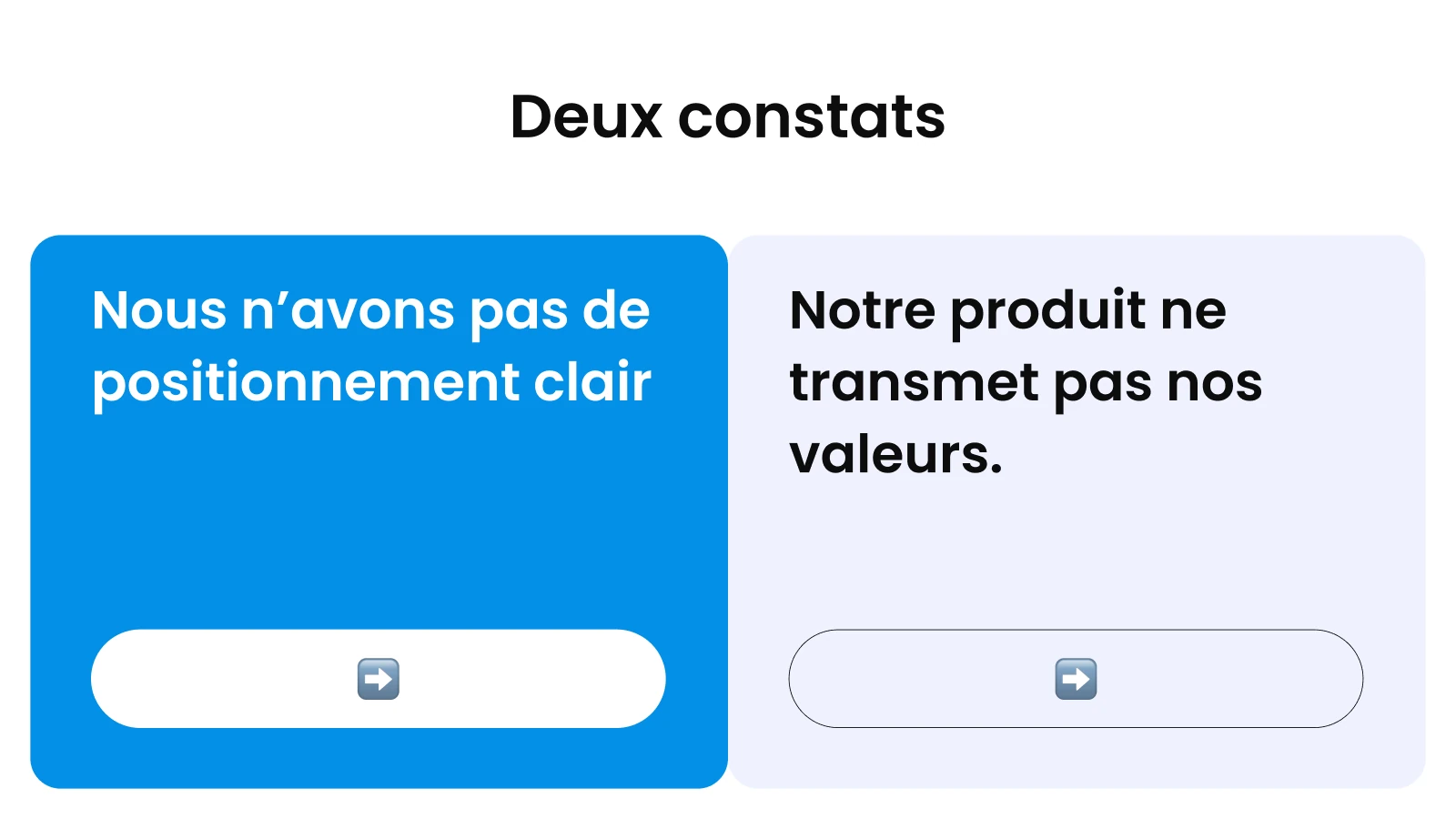
The whole sector was selling green, Electra, Moxion, instagrid or Betteries. Except that the first thing you notice about a generator is the noise, and nobody had made it their argument. We put silence and savings up front, and kept ecology in the brand without making it the slogan.
A name and a logo, with a method
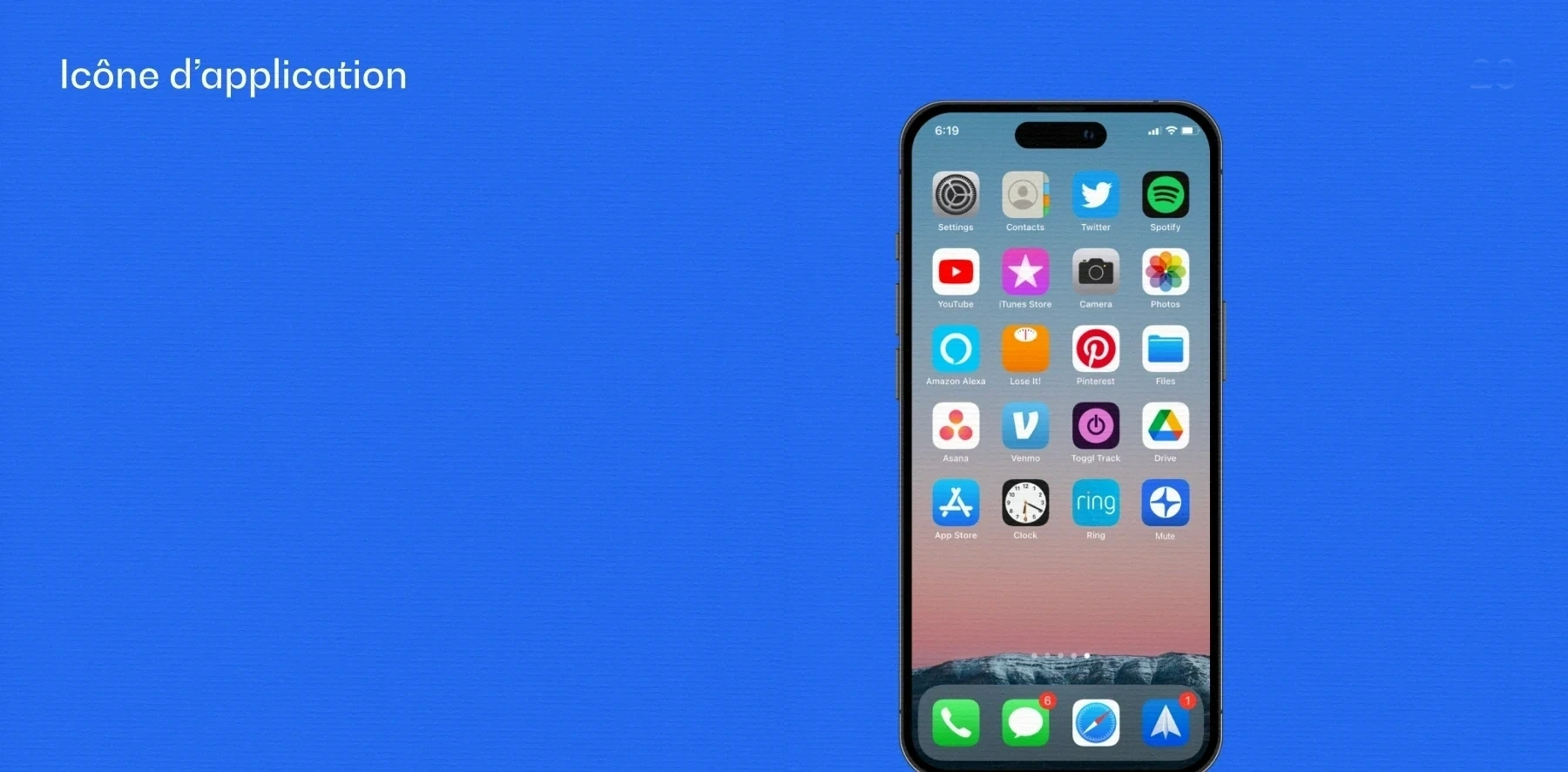
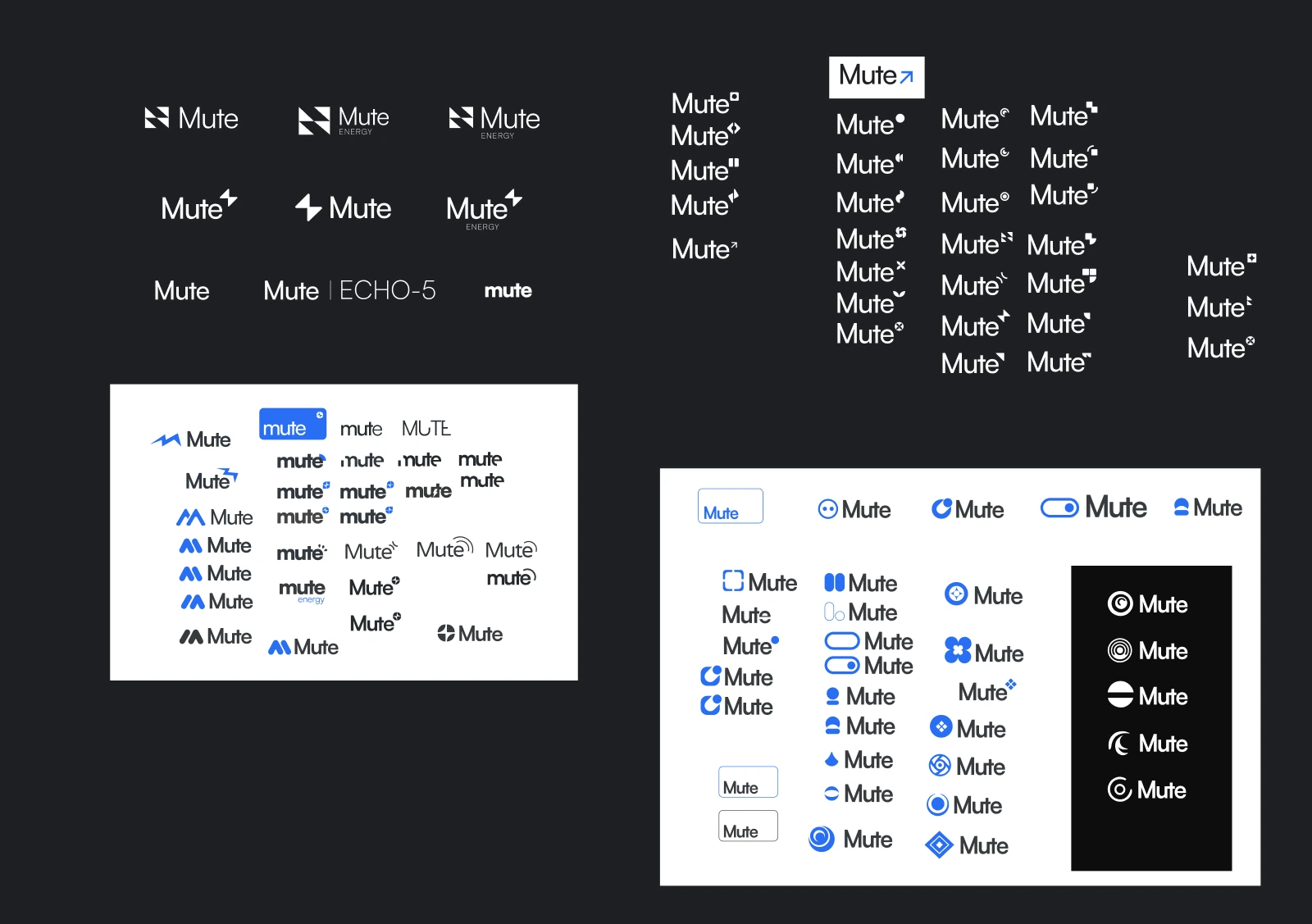
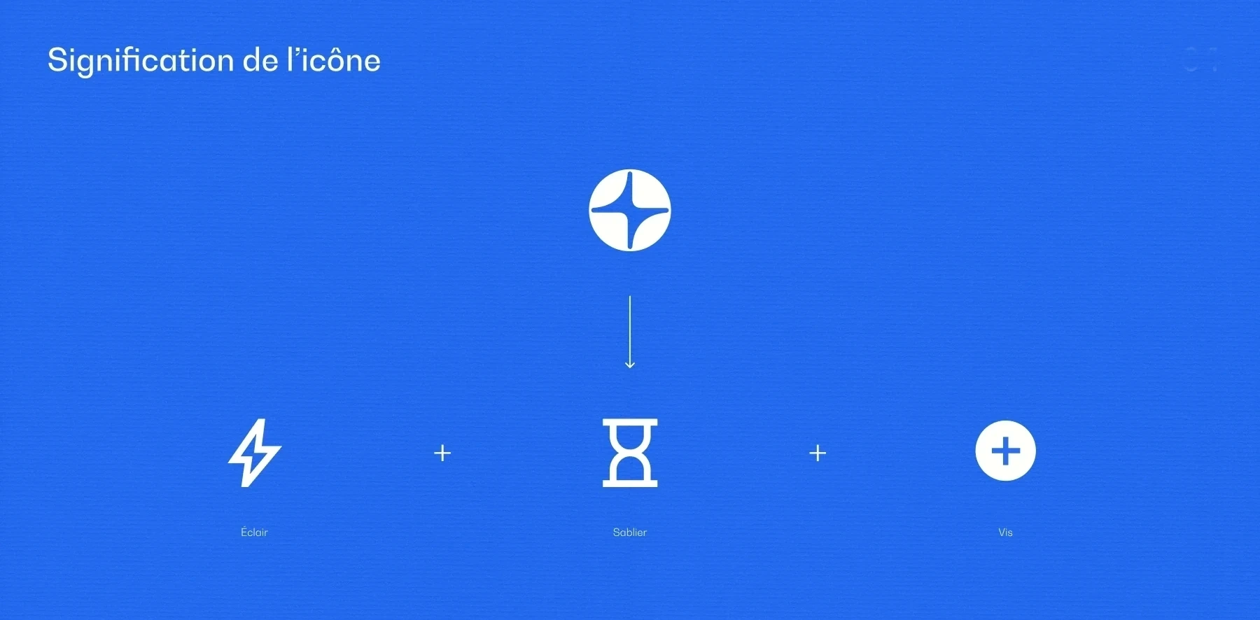
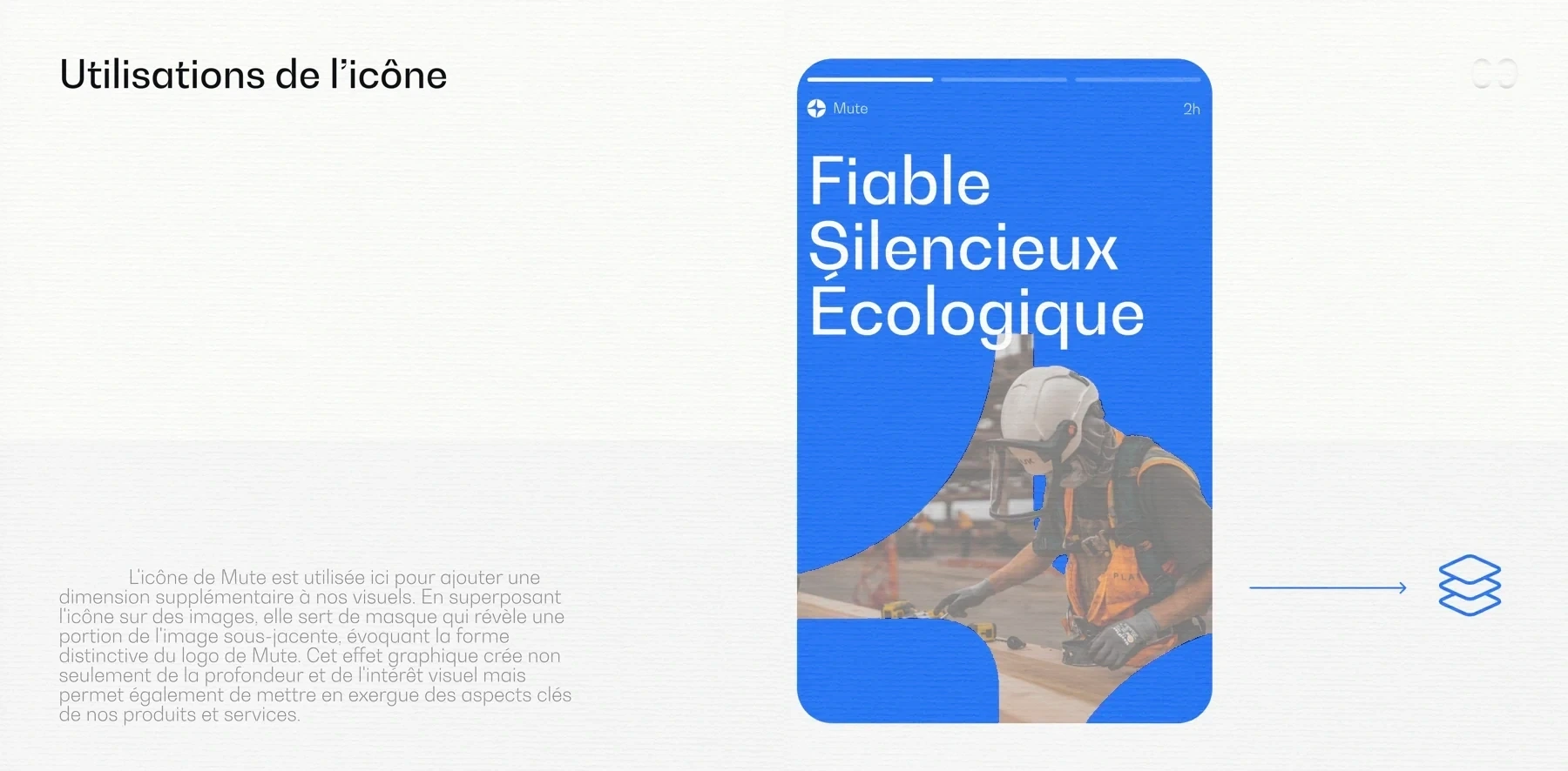
Swoop had to change its name, and I ran a naming workshop with the founders, from research to the vote. Mute came out on top even though I had advised against it, because the name is hard to rank, and when you searched for mute energy, a track called Mute played at a festival called Energy came up ahead of us. For the logo, three directions explored in parallel, and an icon that layers a lightning bolt for energy over an hourglass for the batteries’ second life.
Guidelines so the team can produce without me
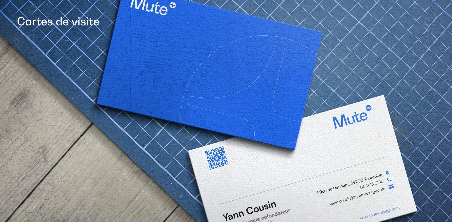
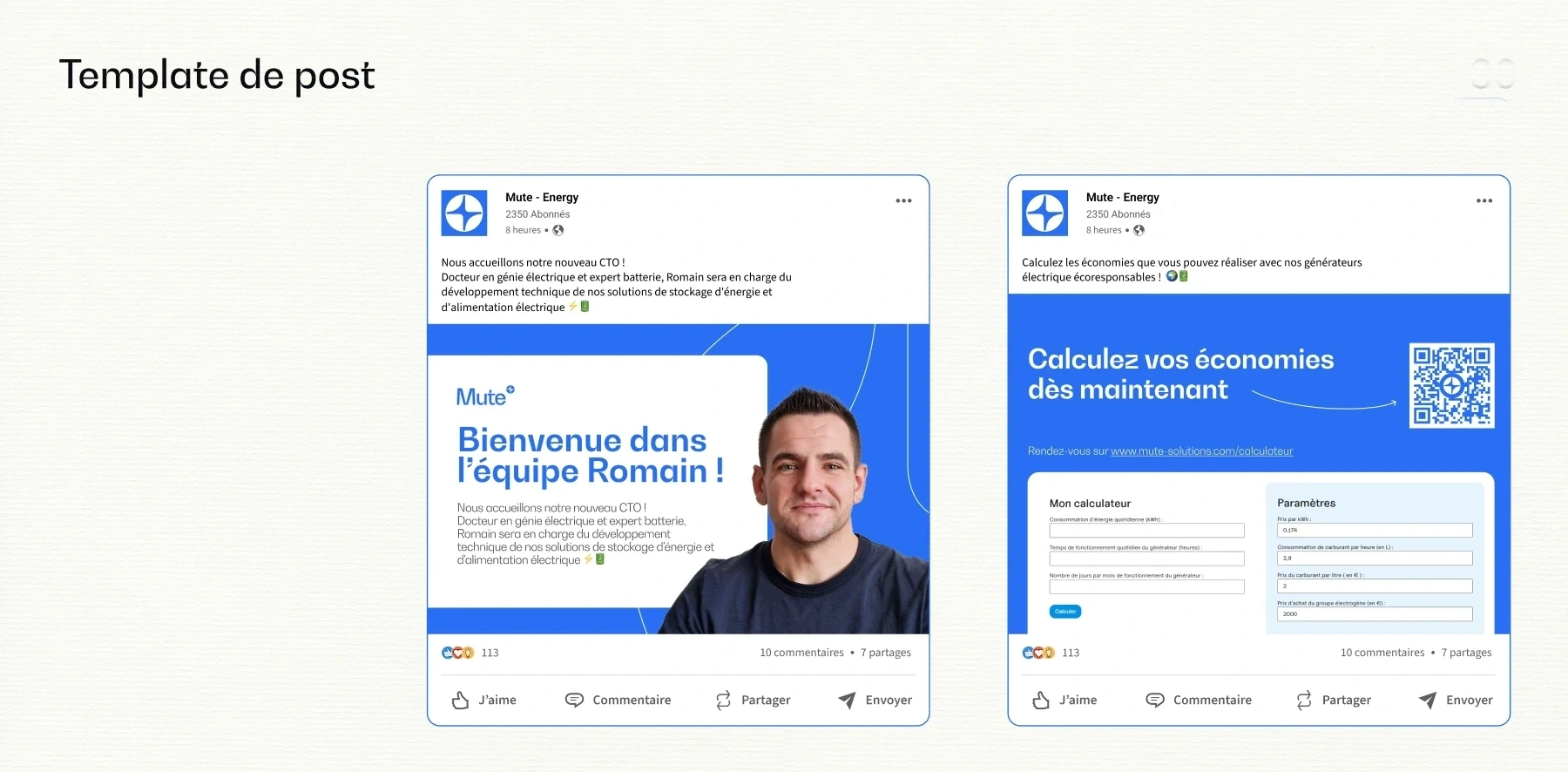
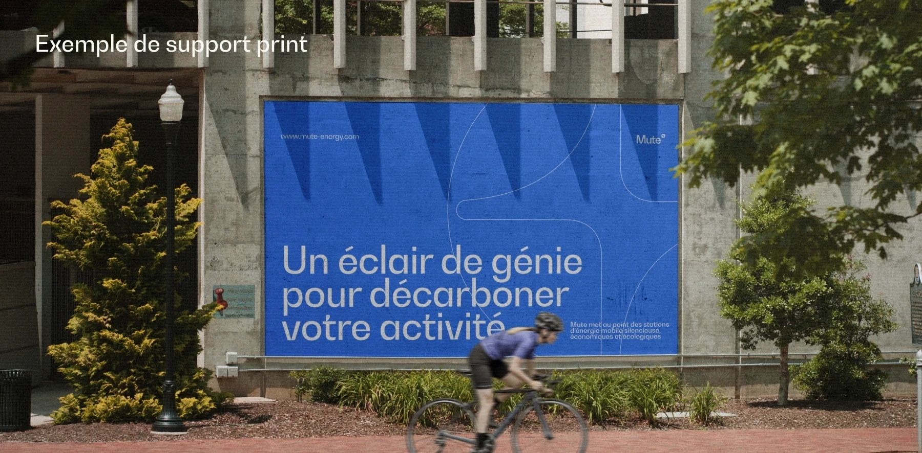
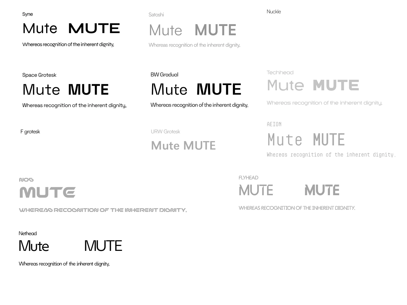
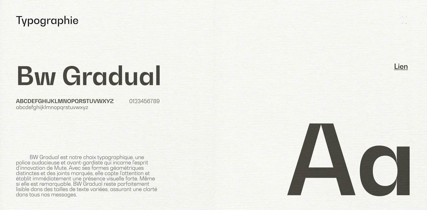
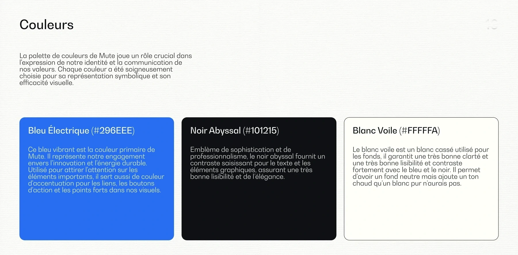
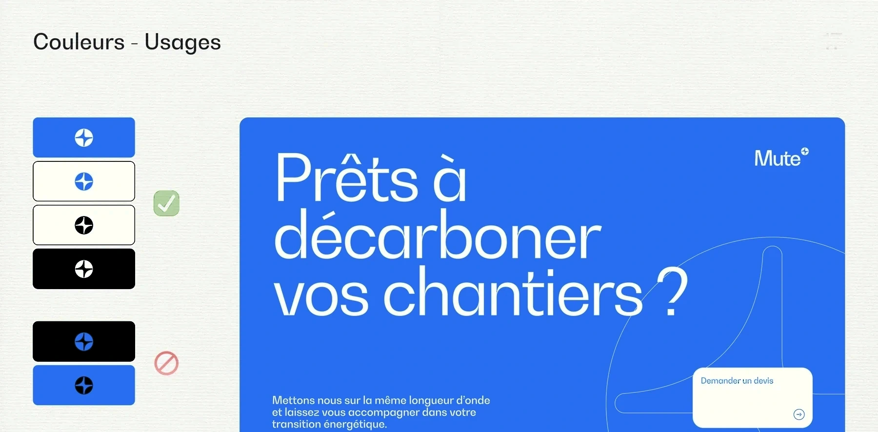
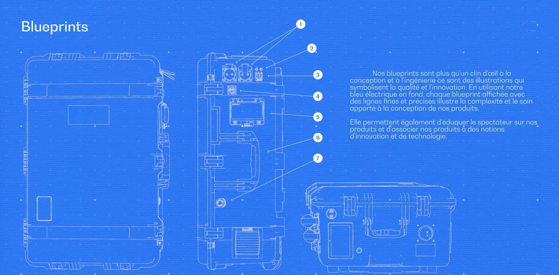
A single electric blue on deep black and off-white, a geometric typeface, Bw Gradual, and blueprints to show how the product is designed instead of photographing it. As the only designer in an industrial company I cover everything from print to 3D, and the brand guidelines keep it all consistent when I’m not in the room.
The result
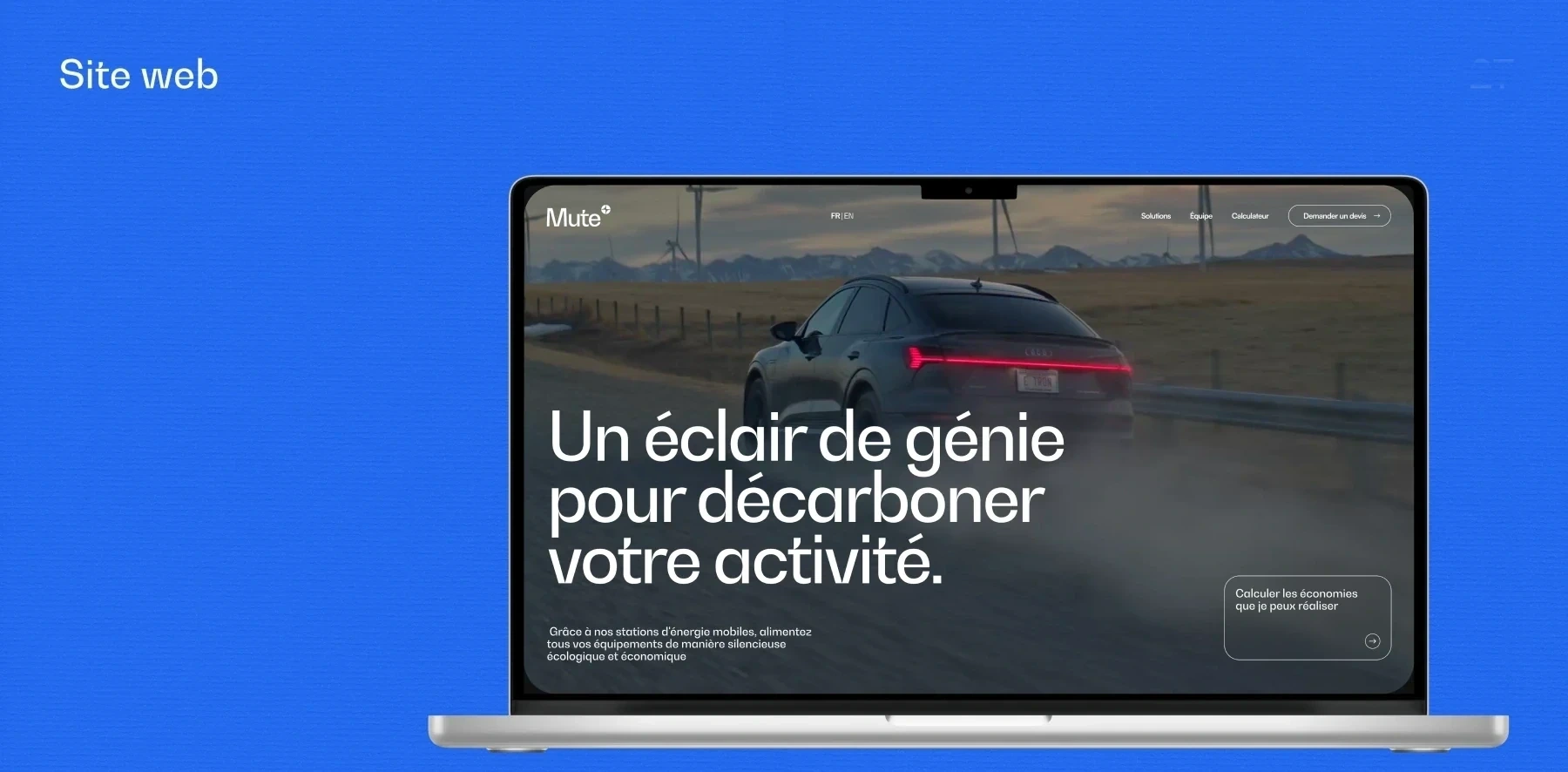
Since 2025, the ECHO-5 has been on the market, certified and assembled in France, and the brand dresses everything a client or an investor gets their hands on, the product, the decks, the manuals and the website. I also designed the website, here is the case study.