Rebuilding the site of a brand that sells to three trades
One landing page per sector, a calculator that makes the price argument provable, and an acquisition audit that reshuffled the priorities.
Mute's site was rebuilt, measured, then rebuilt again. This case follows that cycle across four years: the research that decided the architecture, the audit that measured what was not working, and the SEO review that redefined what the site is actually for.

The starting point
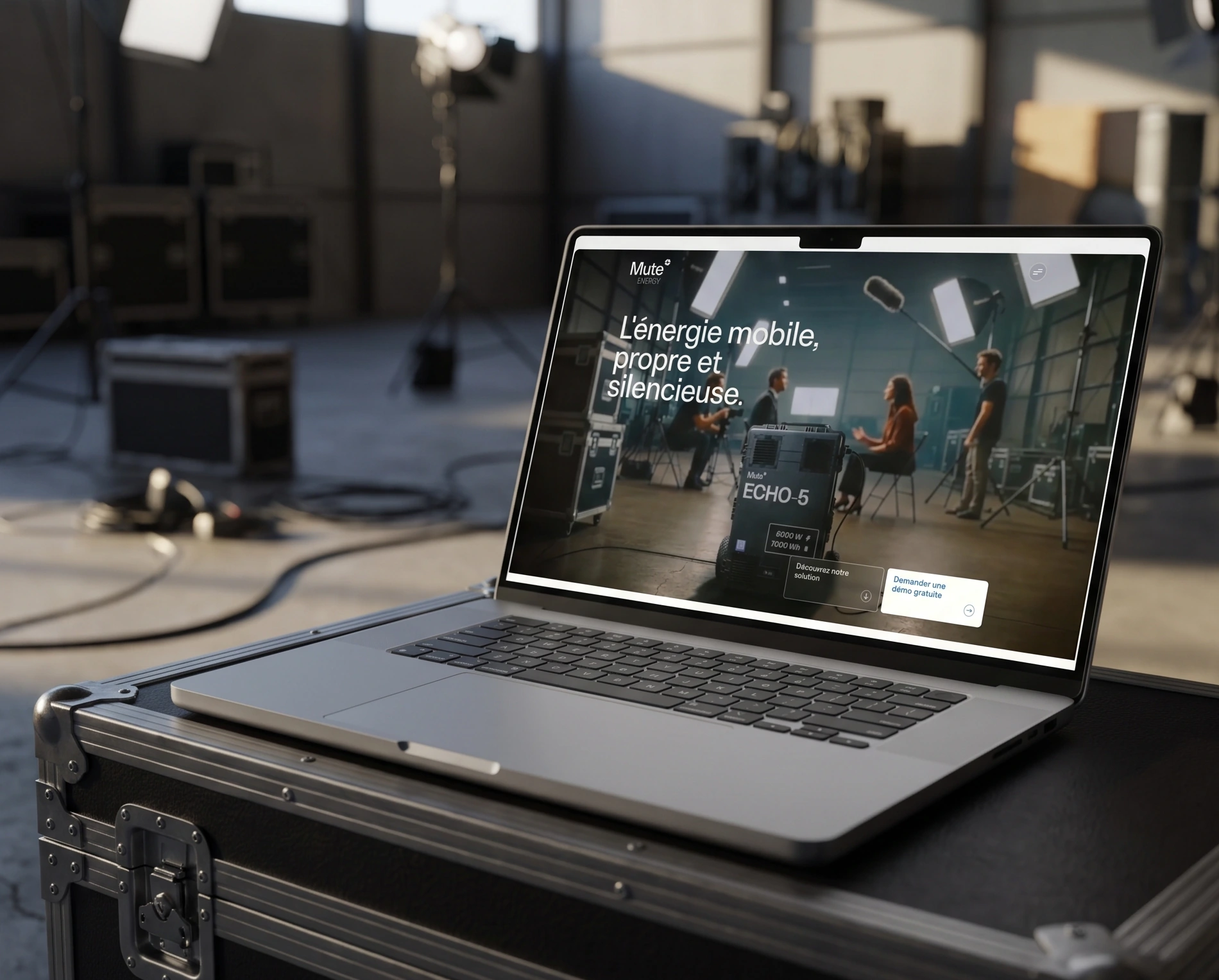
In 2022 the site ran on WordPress with an outside agency: I did the mockups, the content and the SEO, the agency integrated. At the rebrand, everything came back in house on Framer, which I run alone from design to deployment. The ambition went up a notch, a restrained but crafted look, careful animation, 3D.
The research
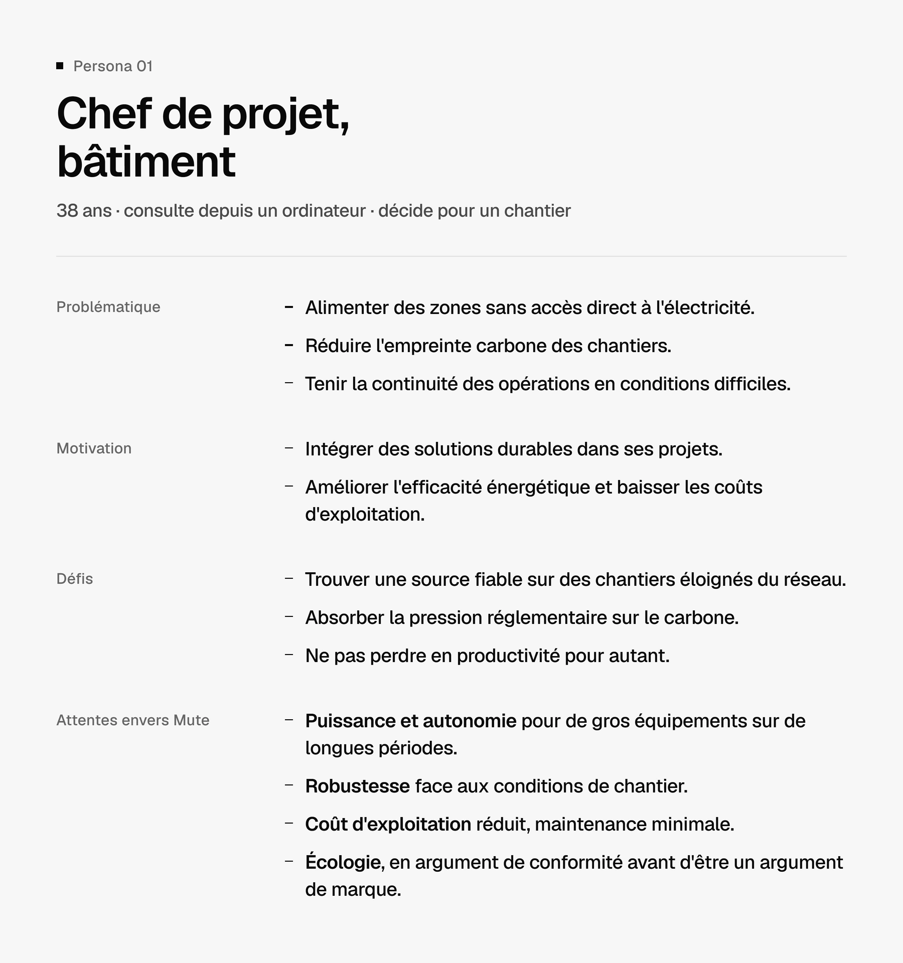
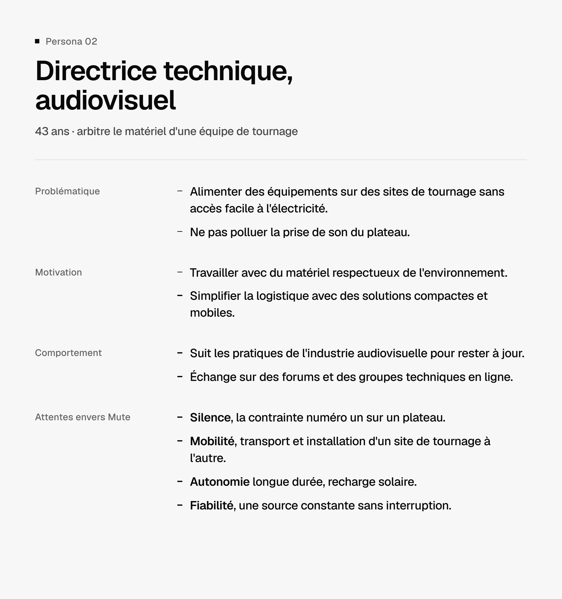
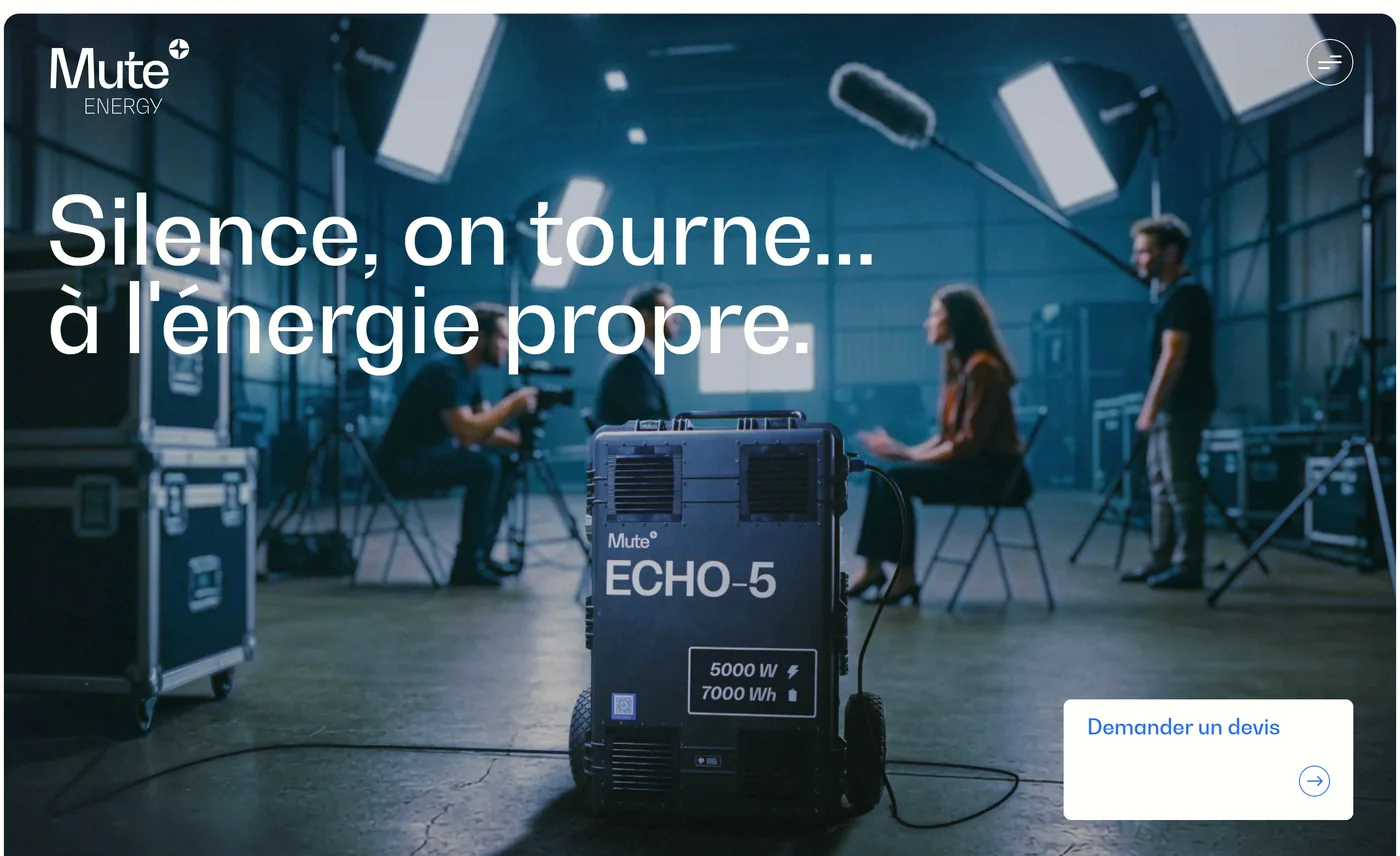
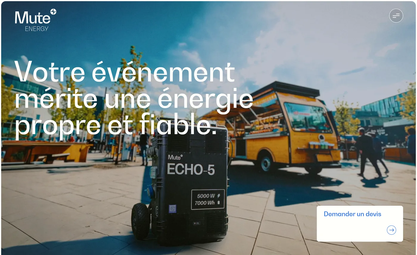
Mute sells to three trades that have nothing in common. I built a persona for each. A construction project manager who needs power, runtime and kit that survives site conditions. A technical director in film and broadcast whose first constraint is noise on set, because a generator ruins a sound take. An events coordinator who wants to power an outdoor site, meet her clients' environmental expectations, and above all deal with a single supplier. Three needs, three arguments. The conclusion fits in one line: pick your sector, then a landing page per sector with its own commercial arguments. The whole architecture of the site follows from that.


The architecture
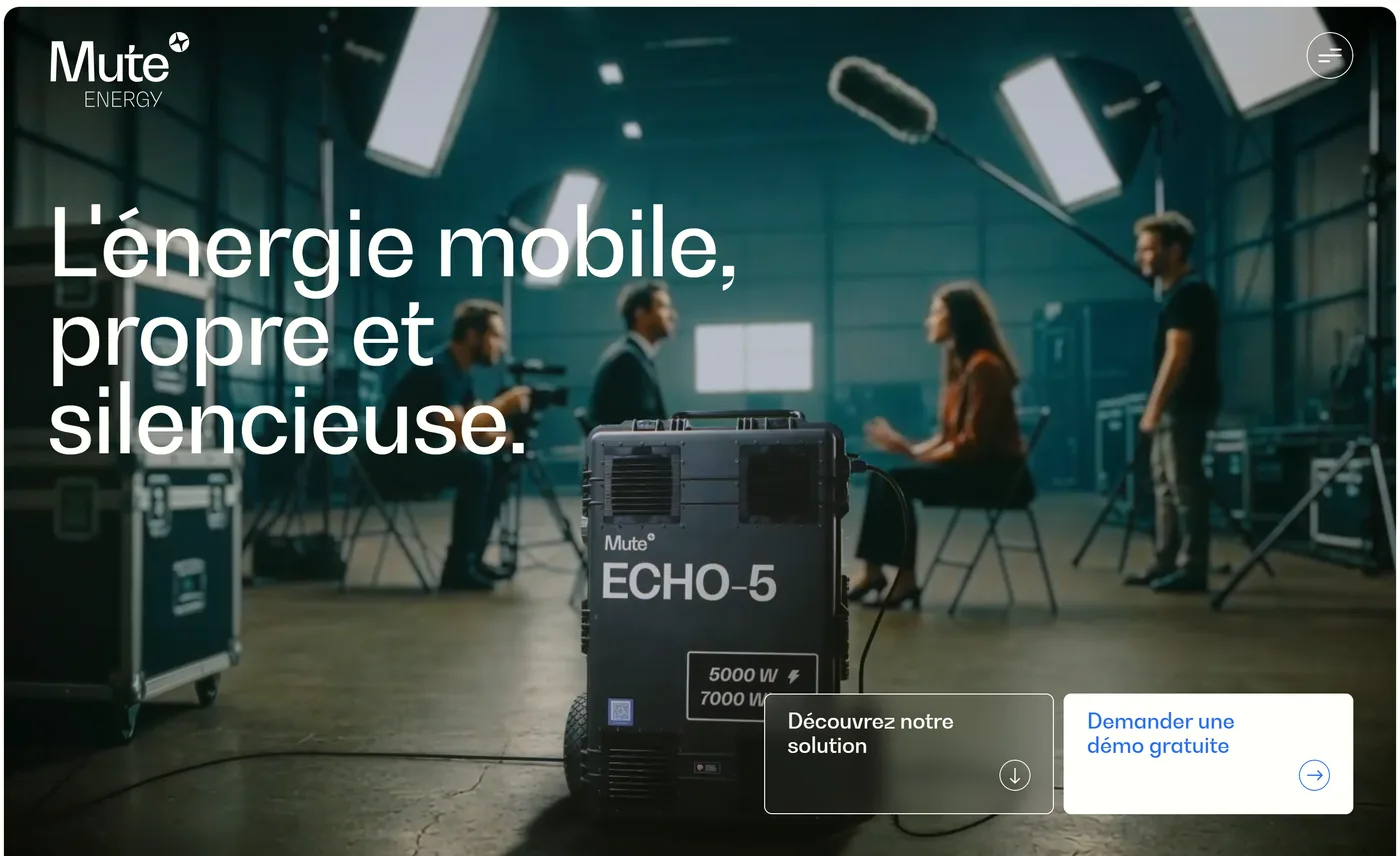
The homepage became a junction whose job is to send each visitor to their sector page. The wireframes were laid out page by page with, in the annotations, the intent of each section rather than its styling. The sales journey was written before the mockups: homepage, sector page, calculator, quote or demo request, email follow-up.

One page per trade
The research gives the architecture, the art direction makes it readable. The same template is adapted for each trade: the structure, the component system and the guidelines stay put, the photograph, the headline and the arguments change completely. A site foreman, a technical director and an events coordinator each land on a page that speaks their language, without the brand scattering.


Showing the product
The art direction shifts register as soon as data or a spec sheet is involved: the ground goes black and the product is drawn as a blueprint, opened up on its components. This is the graphic language set out in the brand guidelines, reused here to show the engineering rather than photograph it. The change of ground tells the reader they are entering technical territory, without having to write it down.
The calculator
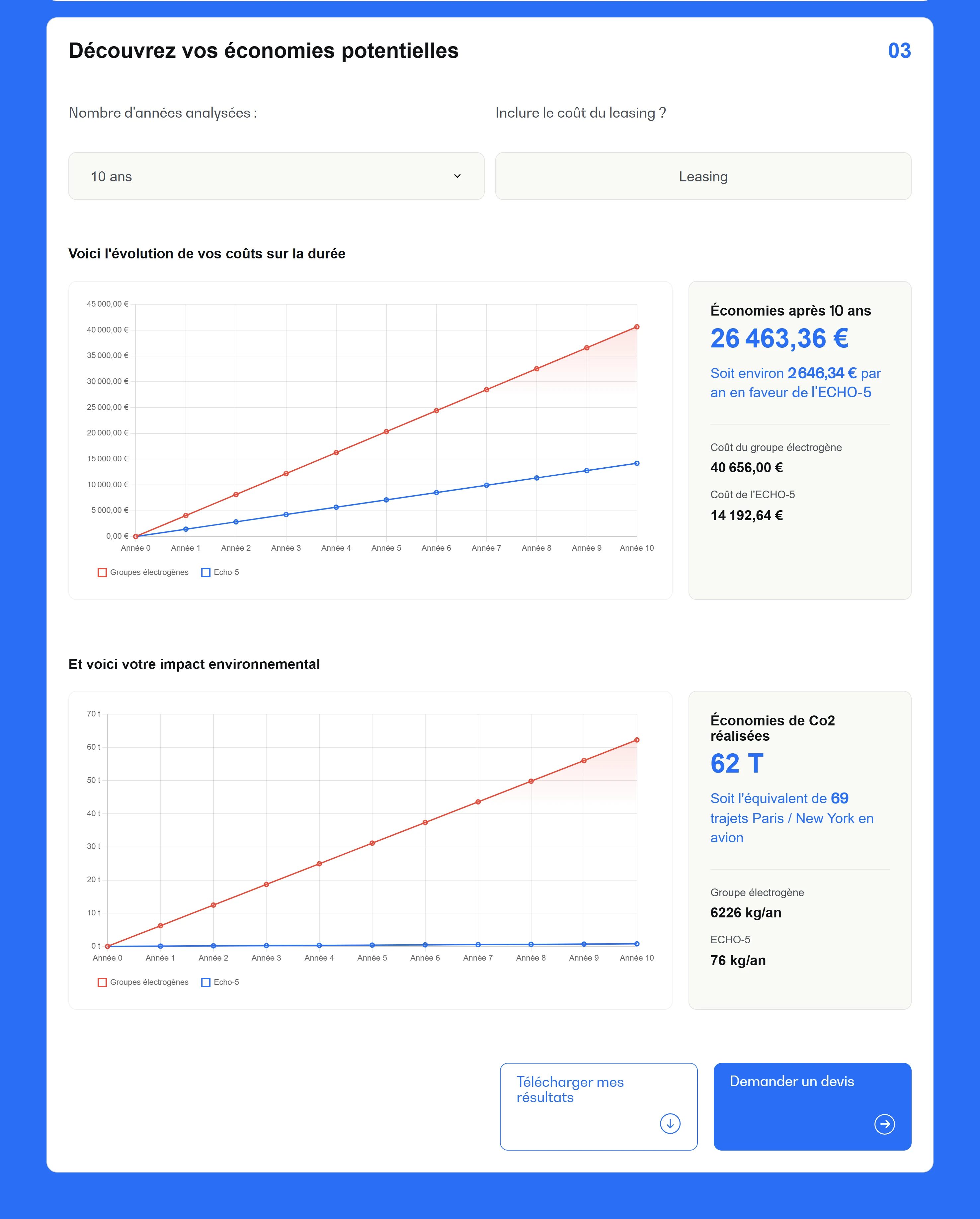
The product costs more to buy than a generator and less to run. That is an argument you cannot sell in one sentence, so I turned it into a tool. You enter your running hours, your days per month, the power rating and the number of generators you use today, and you get the compared costs over fifteen years, the curve showing where the two cross, and the avoided emissions translated into something readable, the equivalent of a hundred and fifty Paris to New York flights. The results can be exported and serve as an attachment to a quote request.

Deciding v2 on measurements
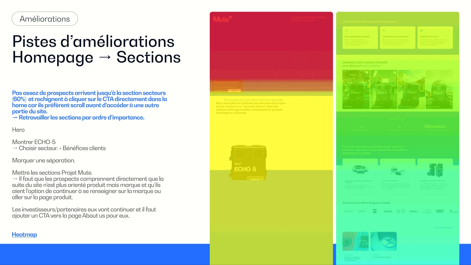
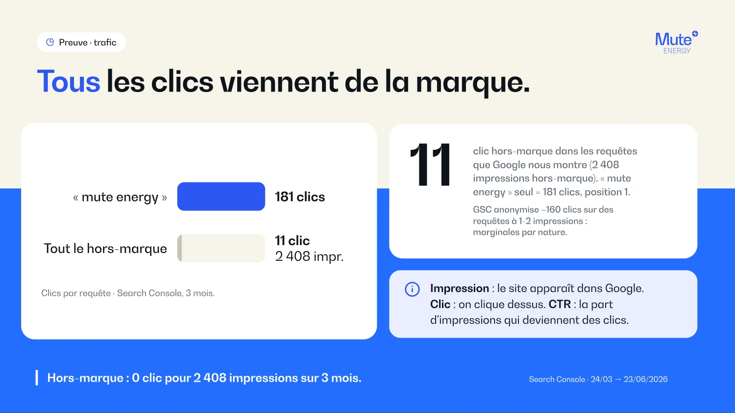
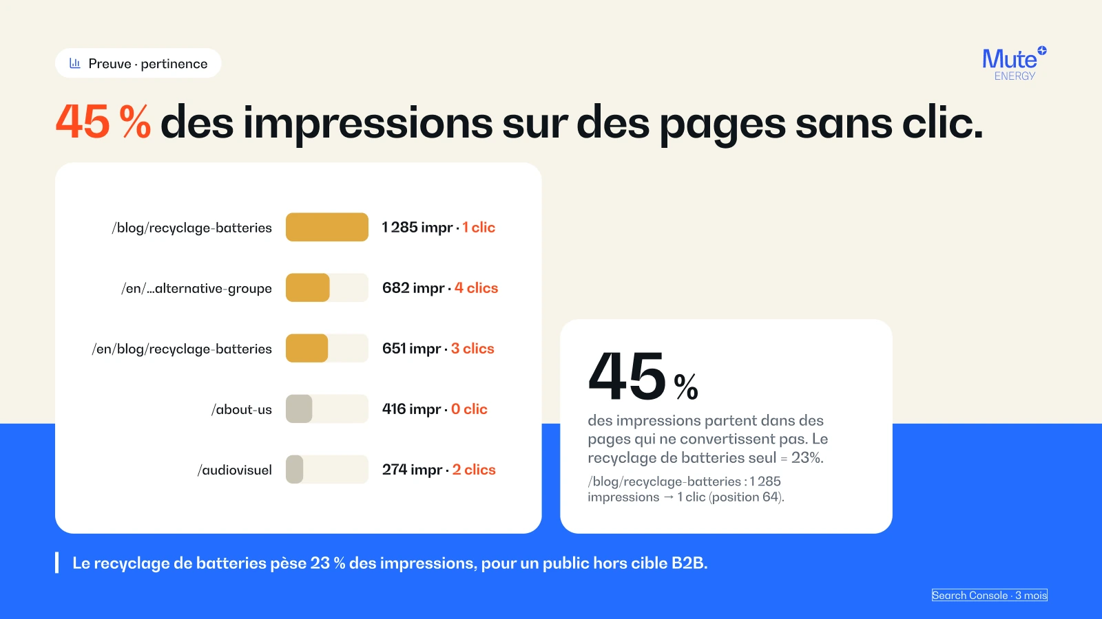
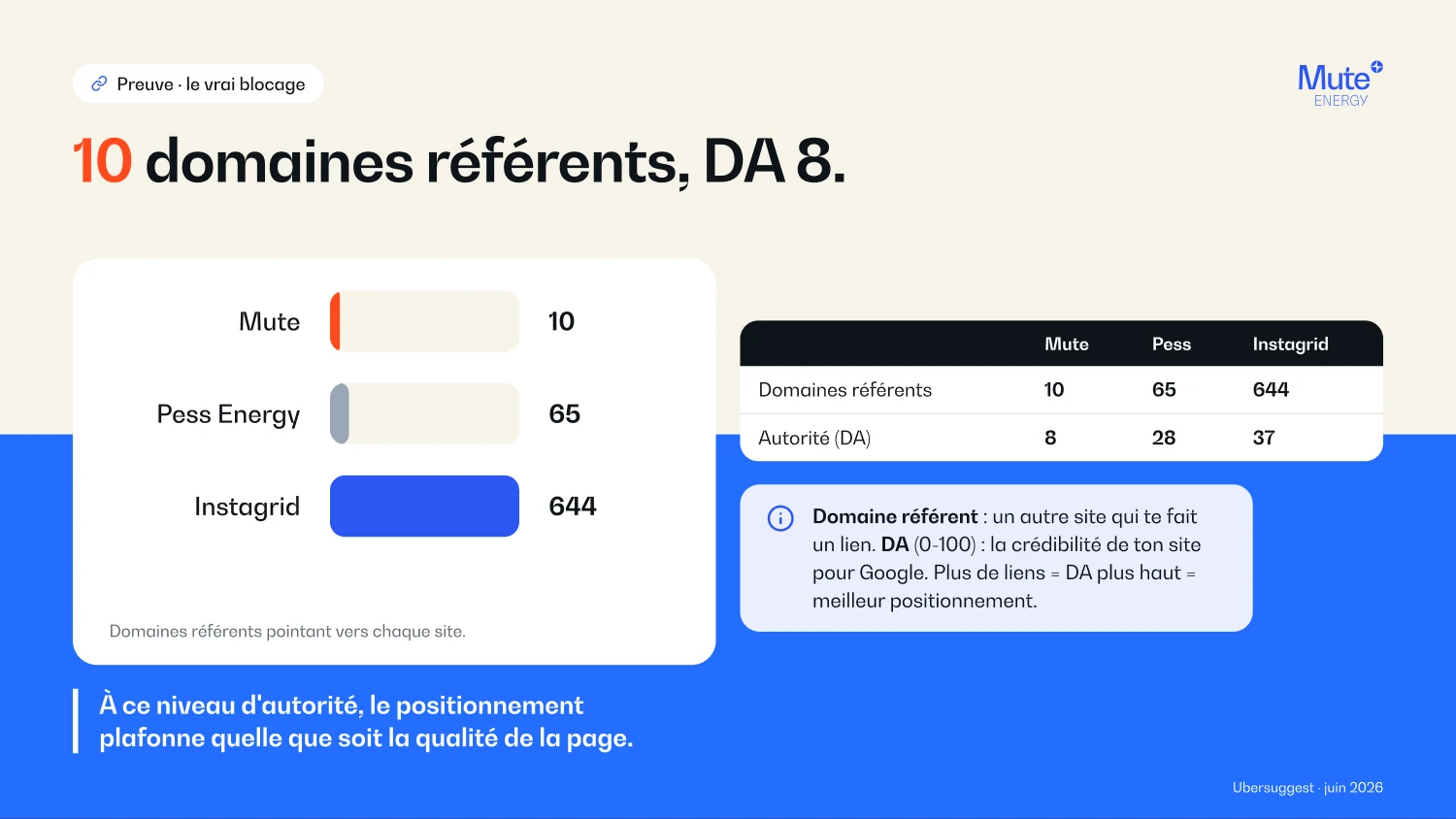
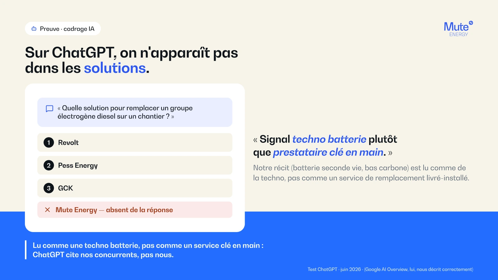
A delivered site is not a finished site. I went back over it with heatmaps, session recordings and then Search Console, to settle v2 on numbers rather than opinions. The sector pages hold up, with close to three minutes average time on the construction page. The homepage sends a third of visitors to a sector page where the target is around half: that is the first lever. On acquisition, what blocks is not the content but the authority, ten referring domains against sixty-five and six hundred and forty for the two European benchmark competitors, while not one institutional partner displayed on the site links back to it. Each finding came out as a fixable route, section by section, with the order in which to tackle them.


What it changes
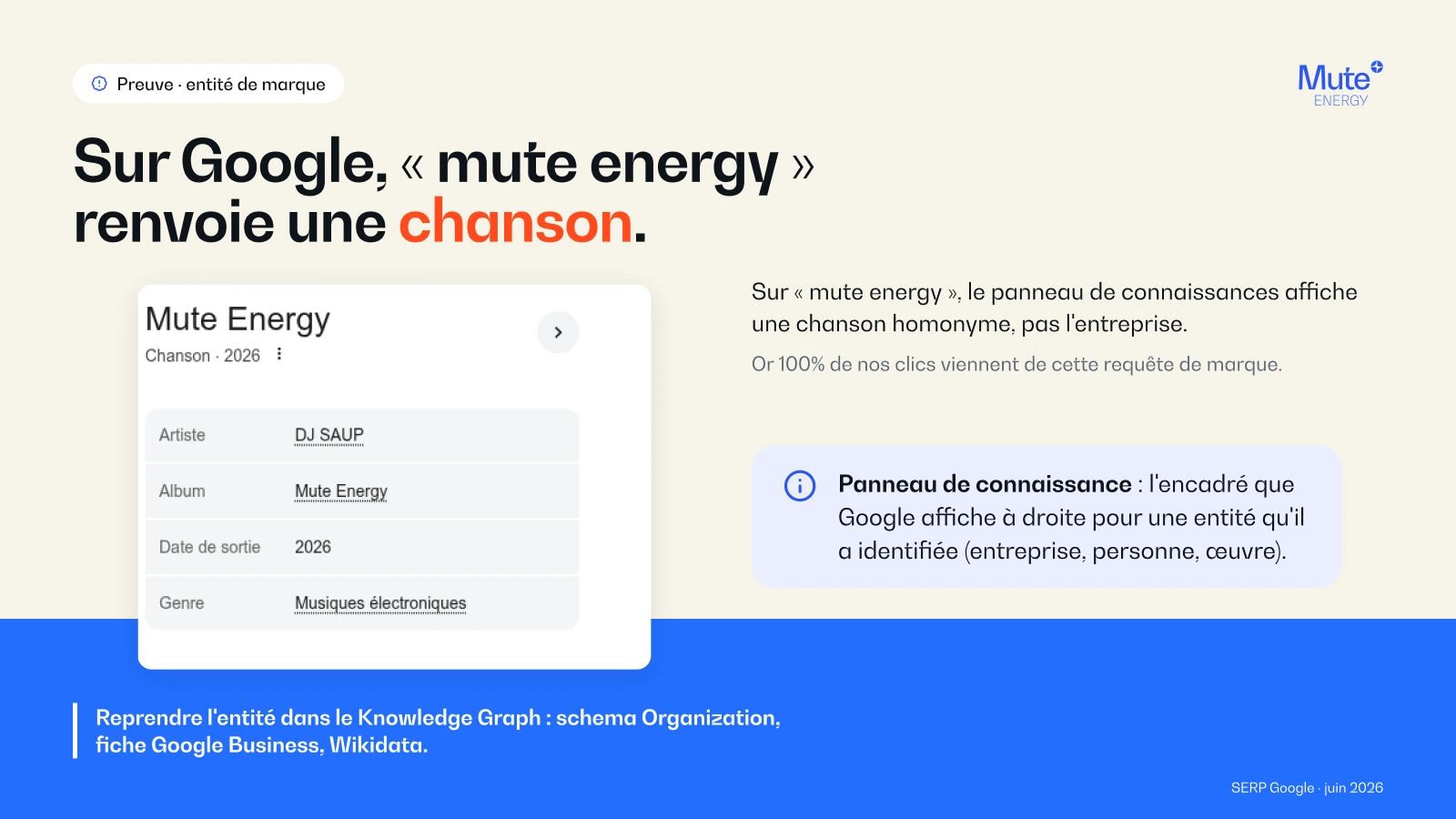
The conclusion changed what the site is for. Leads come from field sales, distributors and key accounts. The site does not discover them, it converts them. So it has to reassure at signature time, recover the links from partners already won, and take back control of the brand entity.
The redesign under way
The 2026 redesign executes both audits. It picks up the vocabulary customers actually type rather than the company's own, puts the homepage back in the measured order, replaces the buttons that do not convert, and publishes the numbers-backed comparisons the company already had internally without ever putting them online.