 Ilies Allali
The complete identity of an AI platform
A brand created from scratch, with its website and product interface, for decision-makers who distrusted AI.
UtopikAI connects AI models to the tools teams use at work. The project came through my network at the start of the AI wave, with the full scope, the brand, the website and the product interface, at the moment decision-makers were most wary.
The identity, set before the pitch
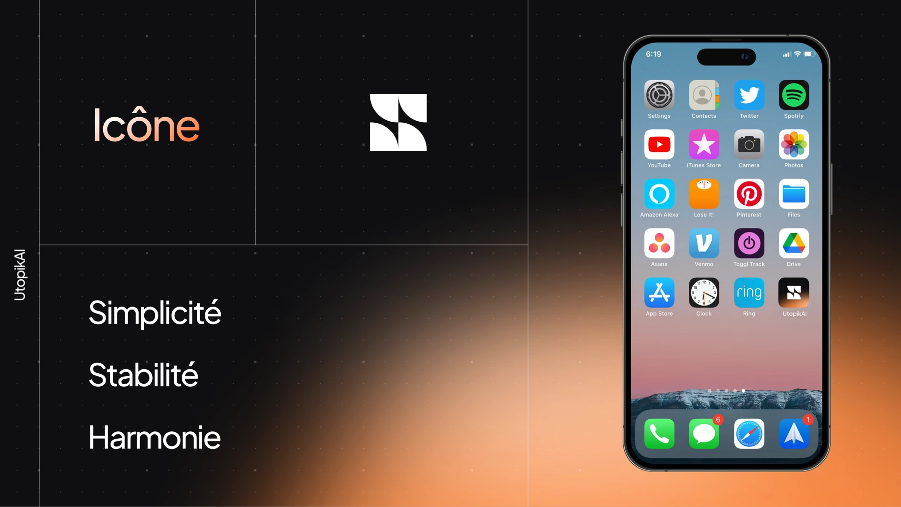
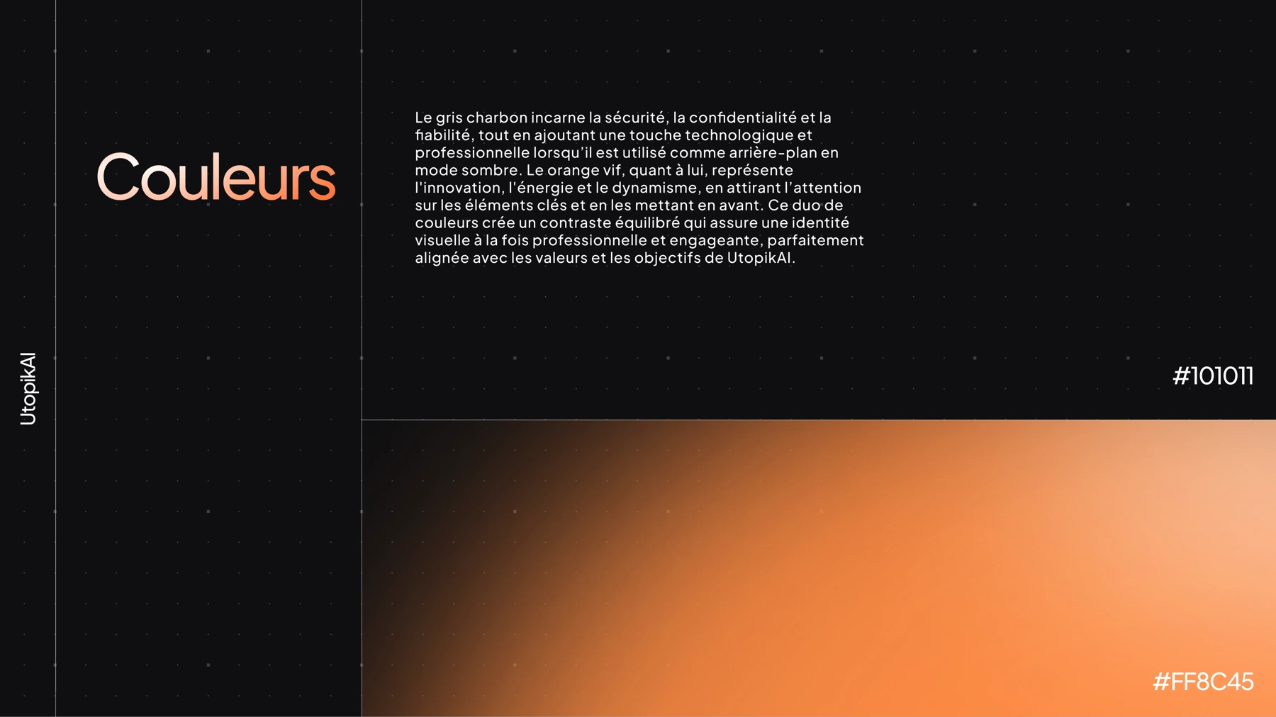
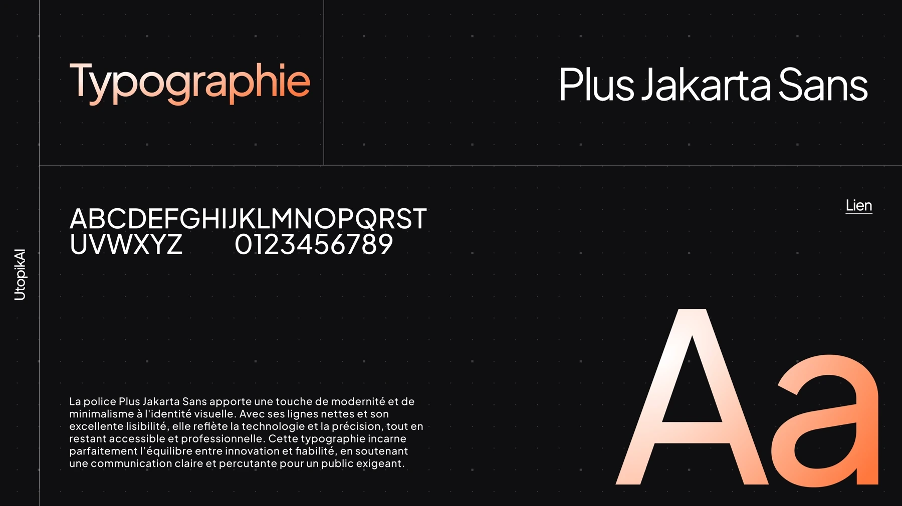
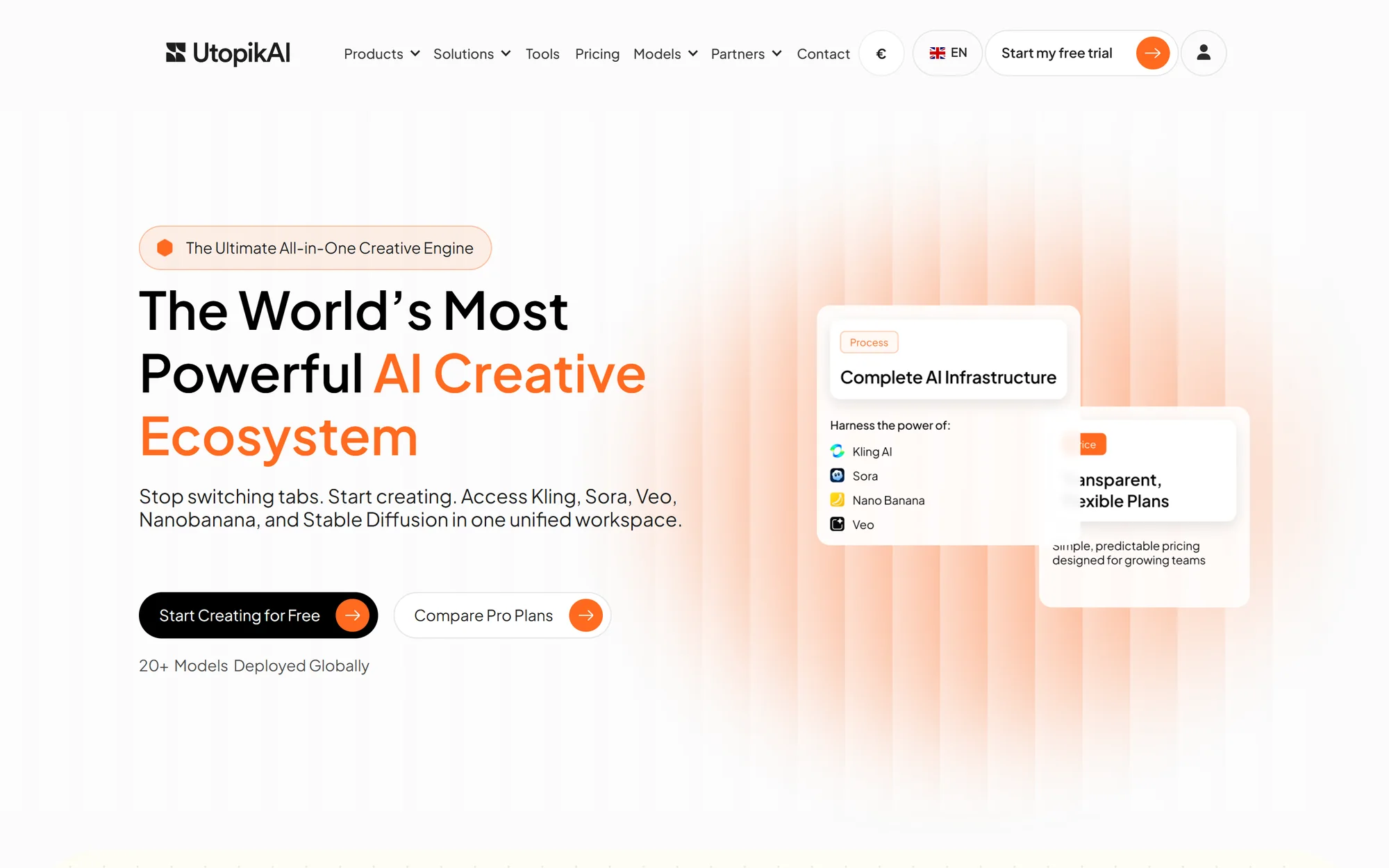
The market answered distrust with purple gradients and futuristic imagery, which was exactly what fed it, so I went the other way. A near-black charcoal grey carries security and reliability, a warm orange humanises and guides attention, and the Plus Jakarta Sans typeface sits on a discreet dotted grid, all delivered with brand guidelines.
A site with no synthetic imagery
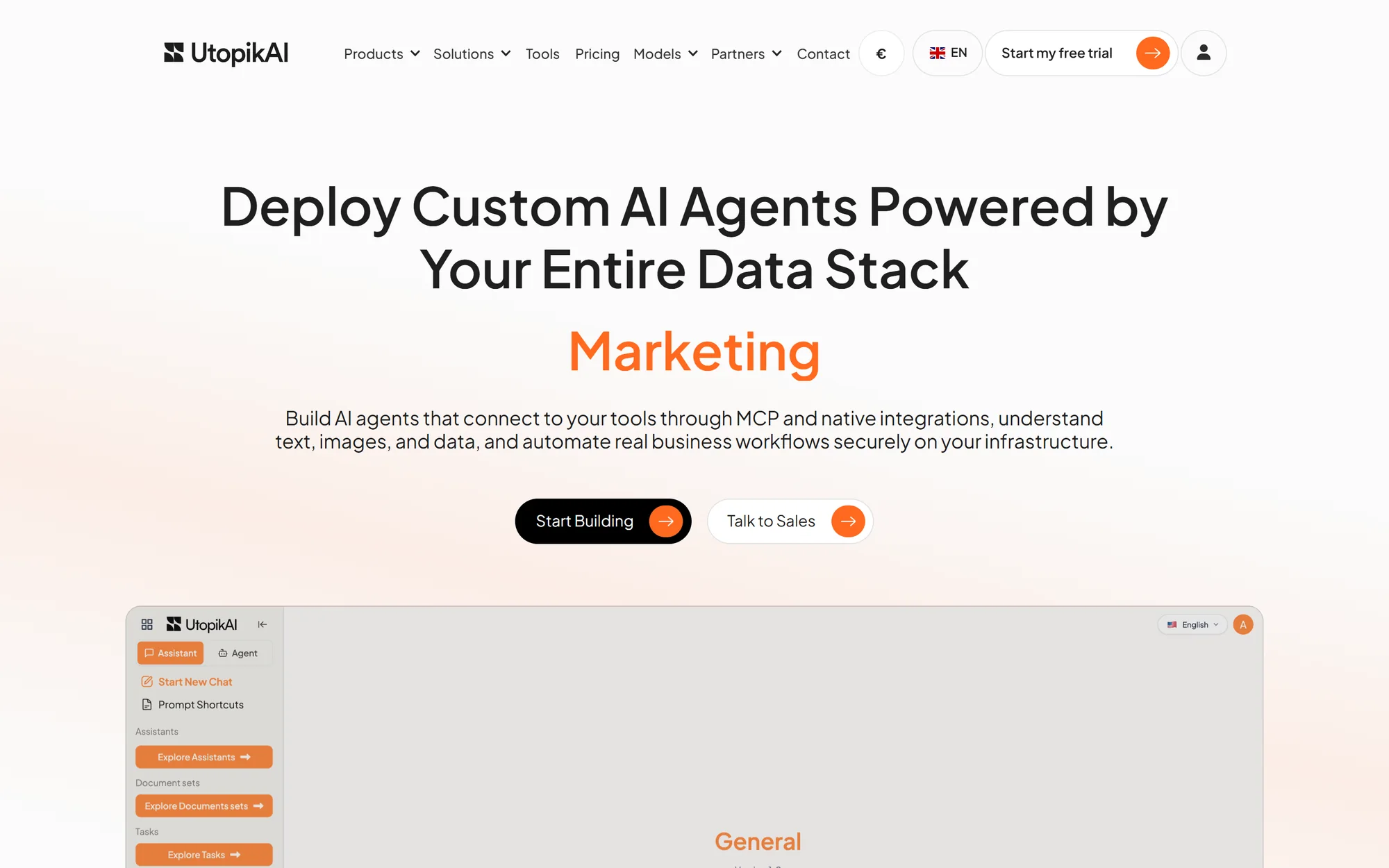
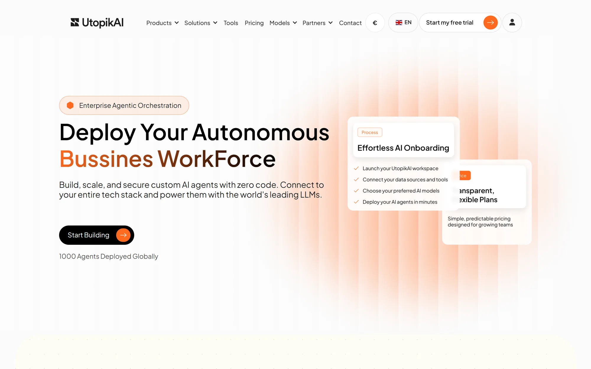
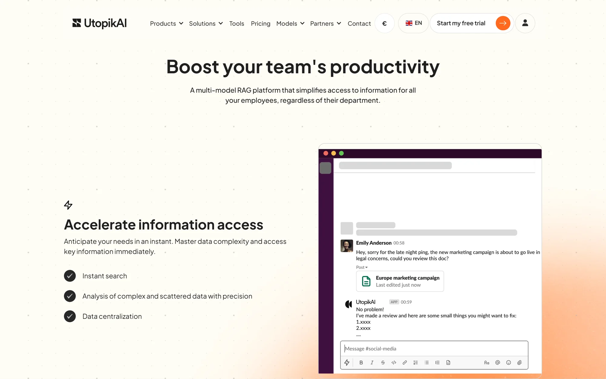
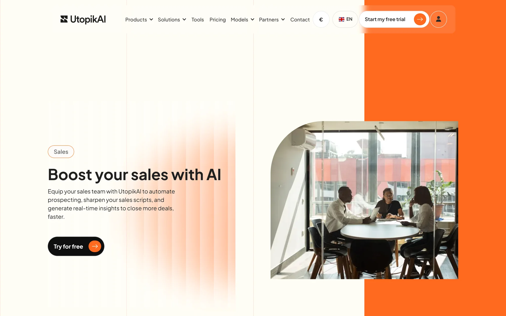
I set myself one constraint for the site, no synthetic imagery. Every page shows the product’s real screen, so a decision-maker can put it up in a meeting without looking like they’re selling science fiction.
Public, up-to-date pricing
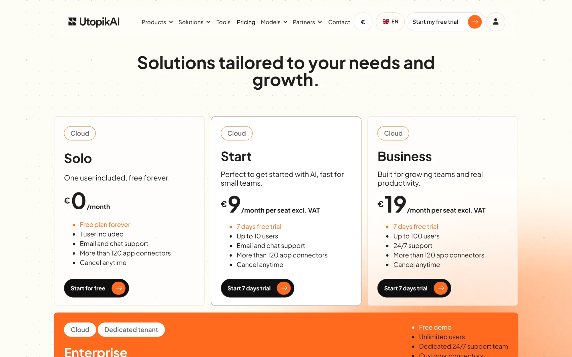
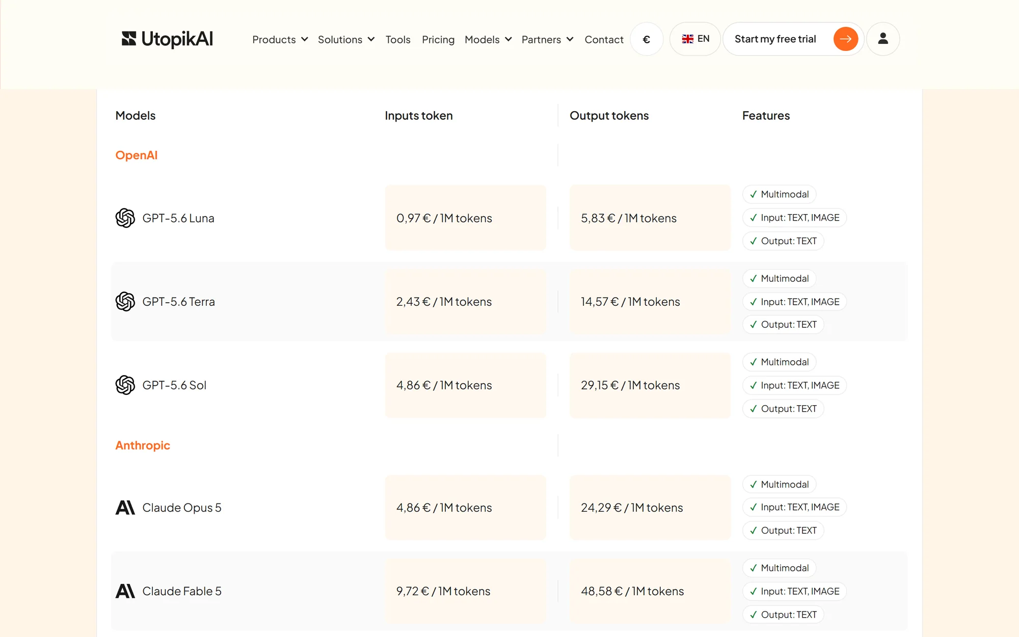
In this market you ask for the price in a demo, and we did the opposite by showing each model’s price per million tokens. Those prices change every month, so I built a small service that pulls providers’ rates and feeds the page live, rather than a fixed table that’s wrong within weeks.
The product in the same voice
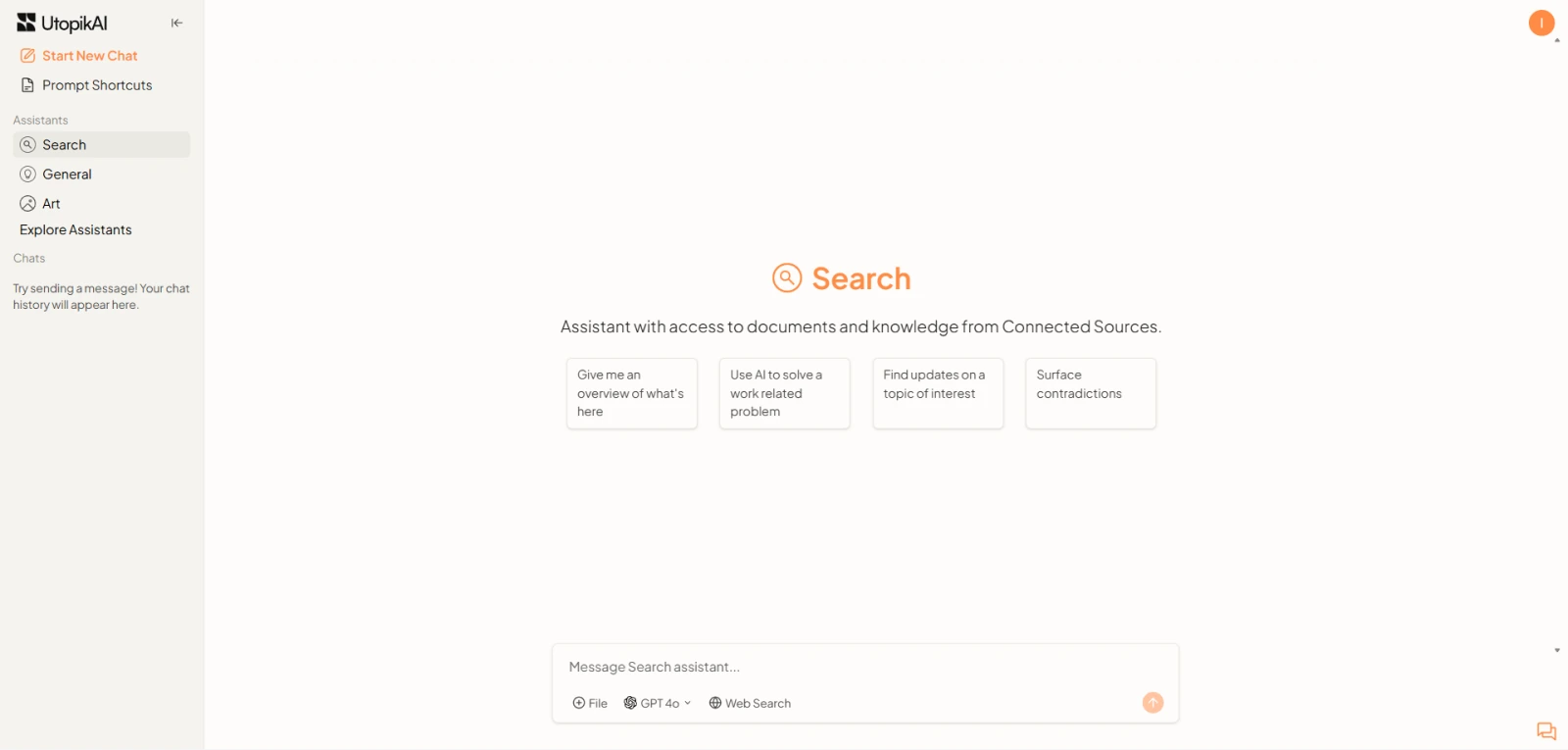
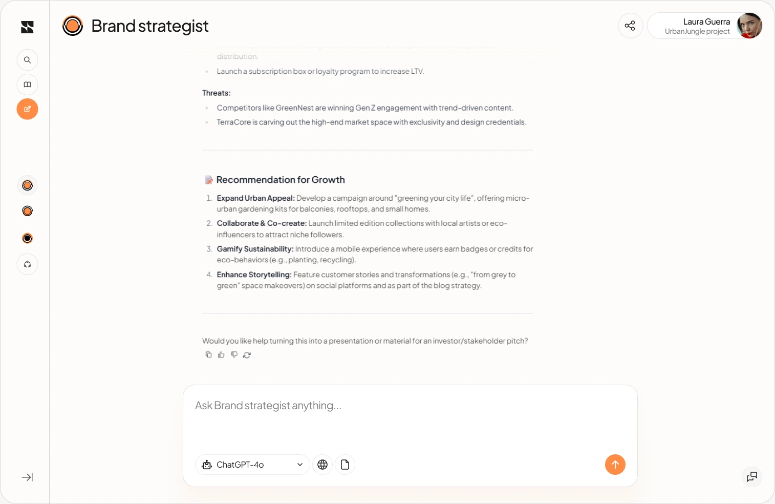
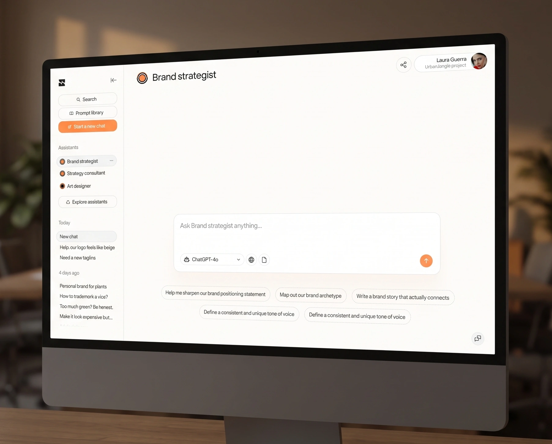
On the product side, a UX audit of the existing app then mockups for a new interface, a workspace per project, specialised assistants, a prompt library and one-click model choice. The same identity runs from the logo to the chat screen. The team has since rebuilt the website, the art direction is still mine.