 Ilies Allali
Putting a face on electrical trades
Three opposing audiences, thirty-seven pages reduced to six templates, and a two-minute orientation quiz.
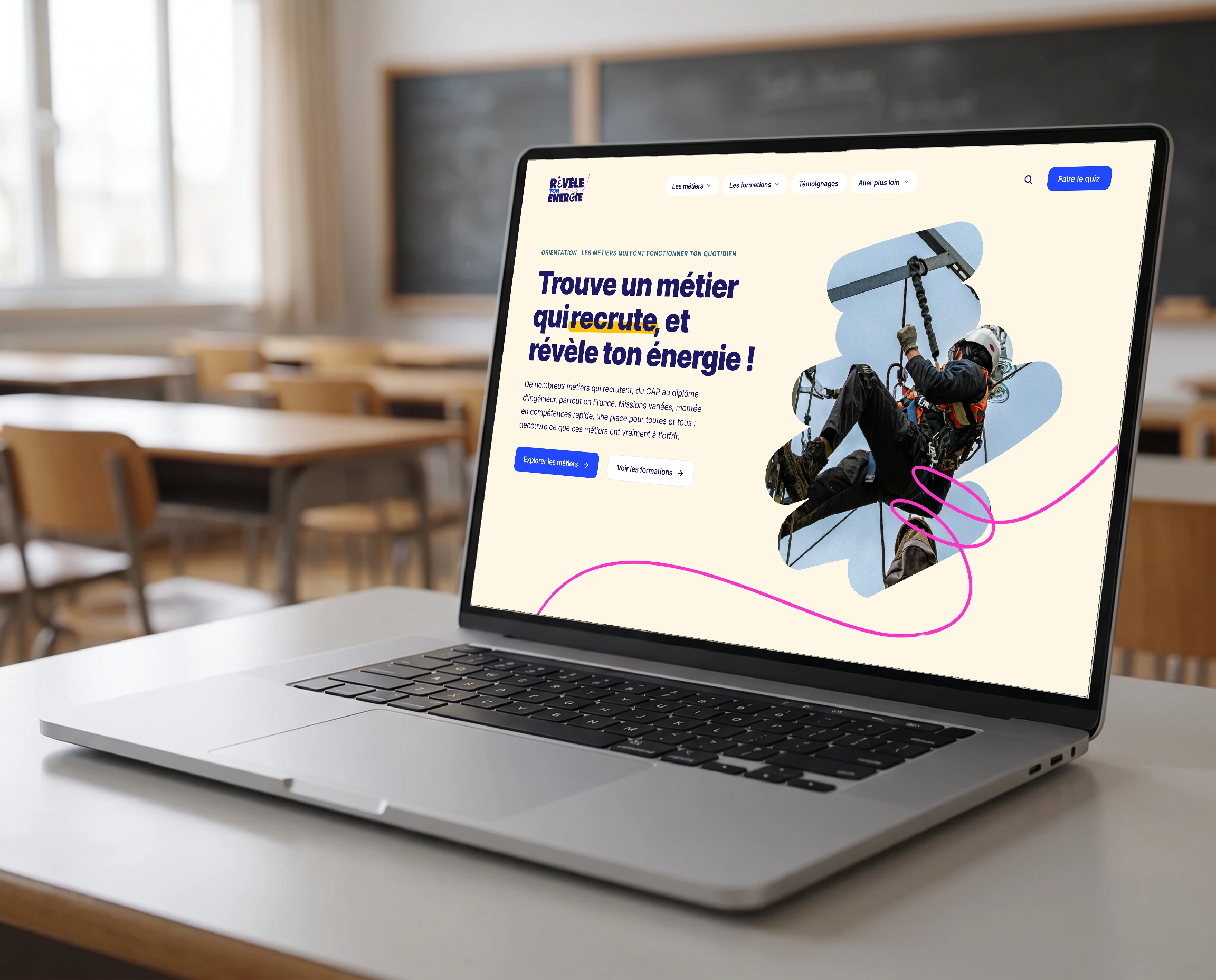
A trade federation for the electrical engineering industry wants to draw young people towards jobs it cannot fill. The project: an orientation site presenting the trades, the training paths and the companies that are hiring, aimed at school students, sixth formers and career changers. I work across the whole chain, from user journeys to the developed site.
The context
Electrical trades are hiring and not finding anyone. The problem is not employment, it is visibility: a fifteen-year-old does not know a job like design draughtsman exists, let alone which course leads to it. The previous site listed information without making anyone want to read it. The brief, carried by a consulting agency running the project on the federation's side, was therefore as much an editorial brief as a website.
What the young people say
The consulting agency ran workshops with five people aged fifteen to twenty-two, from sixth form to undergraduate level, exactly the site's target. The verdict is blunt: if they cannot work out what a site is for within seconds, they leave. They reject dense pages, technical vocabulary and what they call amateur design, and cite Netflix, Snapchat and TikTok as references for clear interfaces. They expect six specific pieces of information: the jobs, the courses, how long the studies take, the schools, the prospects and the salaries. Those conclusions settled several of the project's decisions, starting with mobile first and with the refusal of an institutional tone.
The framing
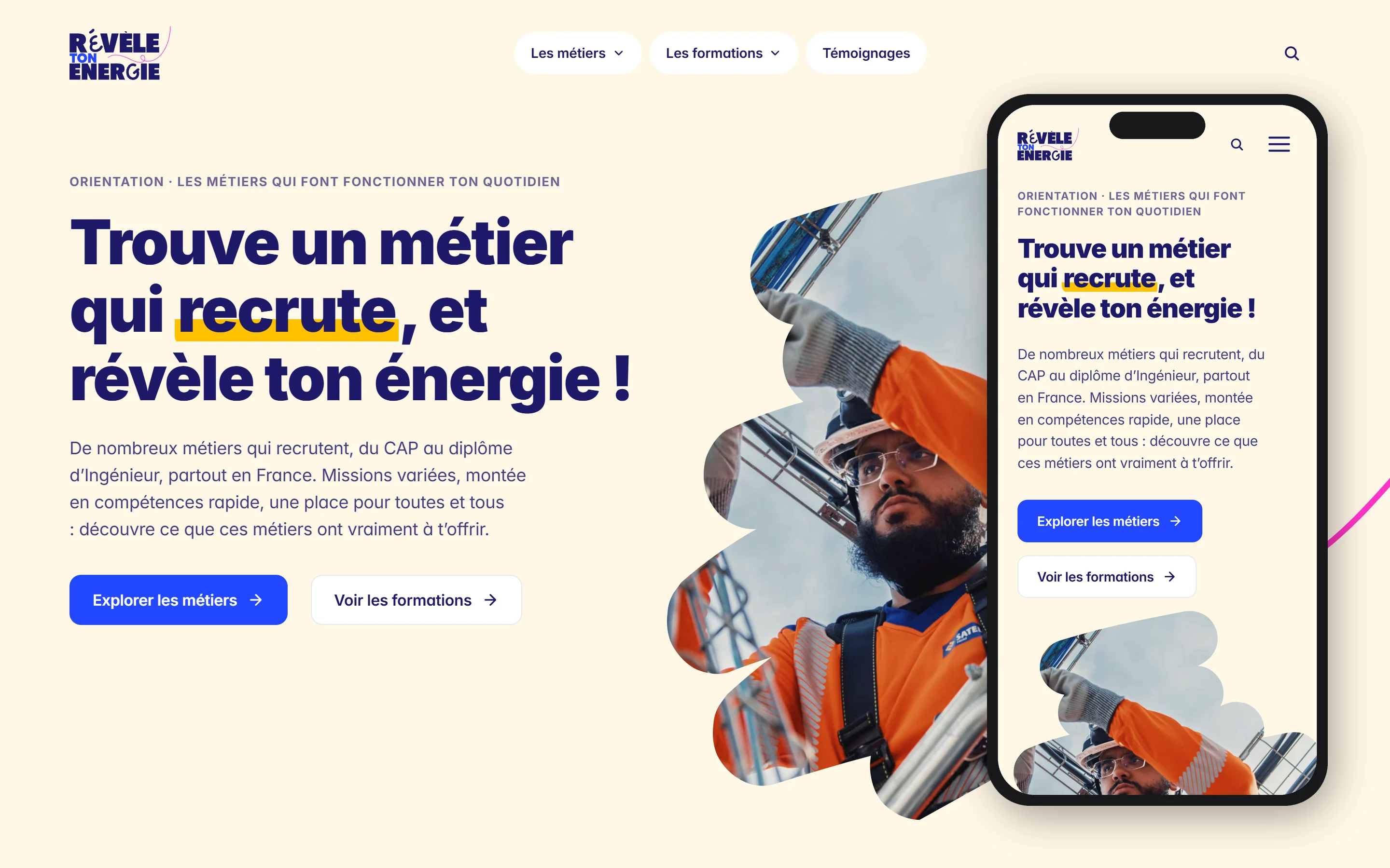
Three audiences with three opposing logics: a school student exploring without knowing what they are looking for, a sixth former comparing routes, an adult retraining who wants to know how long the switch takes. I set the personas and the journeys before the architecture, then wireframed mobile first, because the primary audience does not browse this kind of site on a computer. Navigation is organised around two entry points, the trades and the courses, with a path that lets you cross from one world to the other at any moment.
The art direction
The trap with an orientation site is the institutional tone that scares off exactly the audience you are aiming at. So the direction starts from a light, warm base rather than the technical blue the sector expects, with a handwritten highlight on the words that matter. The real problem was elsewhere. The brand palette holds twenty-nine shades, bright ones, pale ones, six levels of navy ink and seven of off-white, and a decision taken with the agency's art director makes all of them delicate to place: no colour is assigned to a family of trades, so as not to box a young person in before they have explored. A rich palette whose job is precisely to mean nothing. The pale shades do not classify, they punctuate: the background fades from one step to the next as you scroll, giving rhythm to long pages, without ever telling the reader which category they belong to. Pale yellow stays the one shade free of meaning, and it carries the qualification levels.
The template system
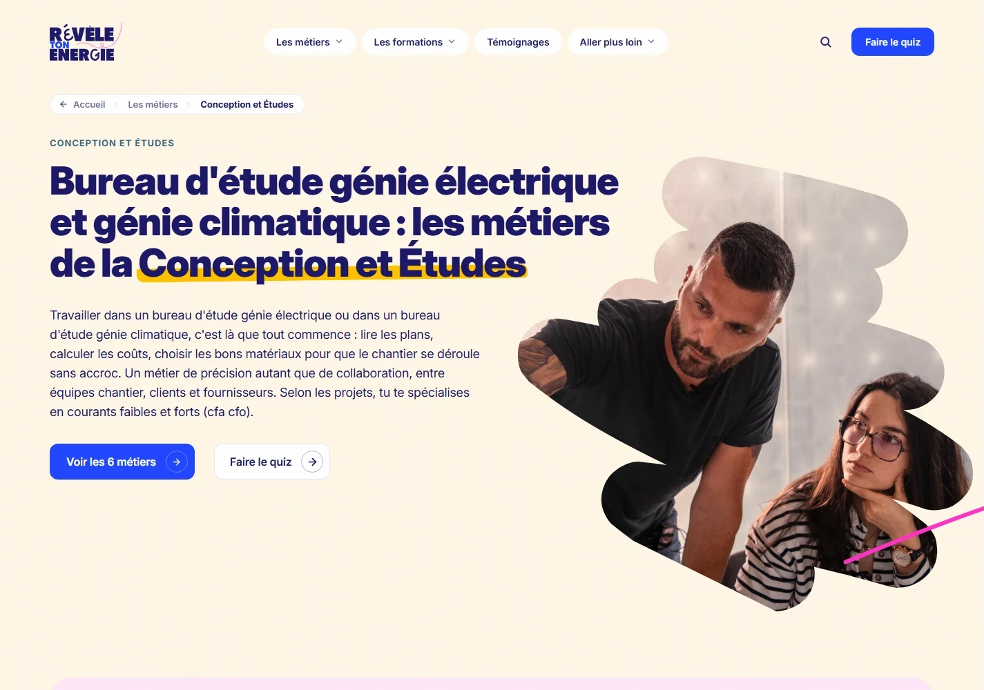
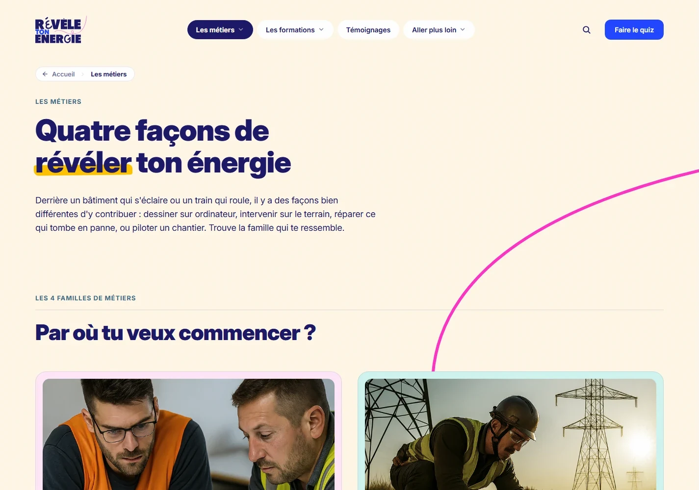
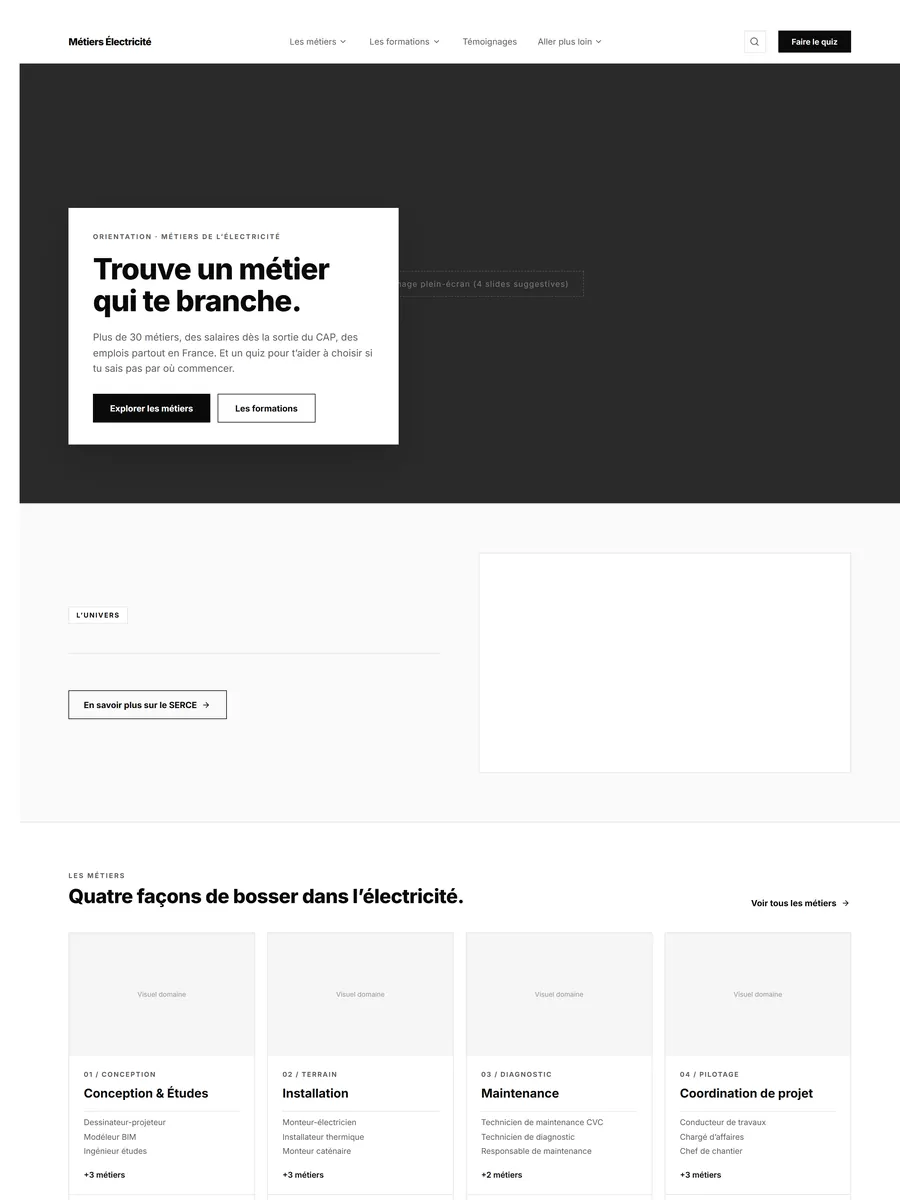
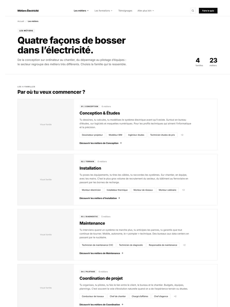
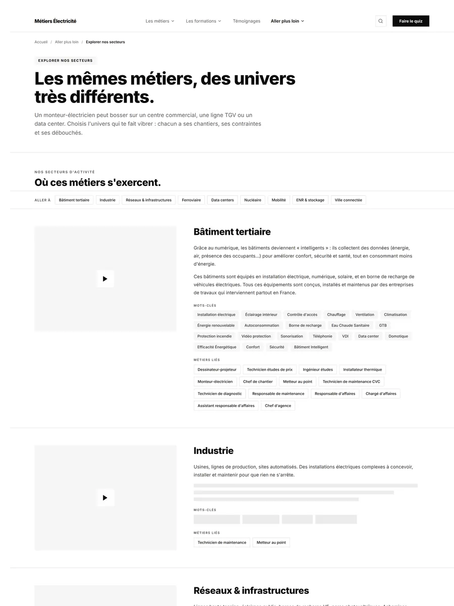
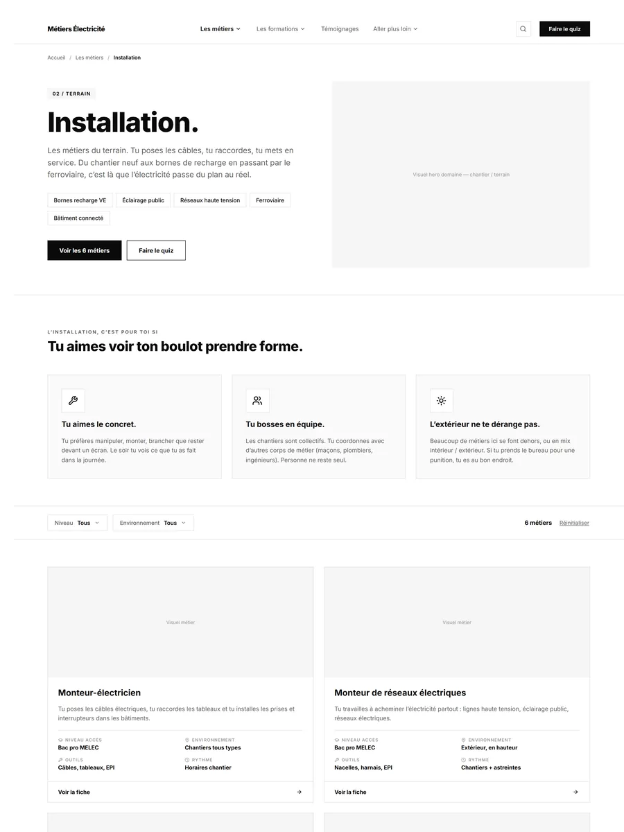
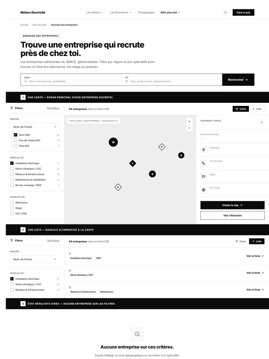
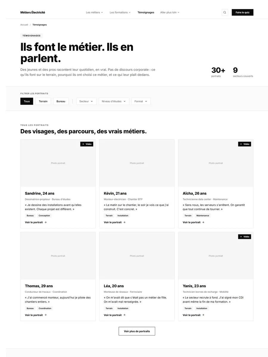
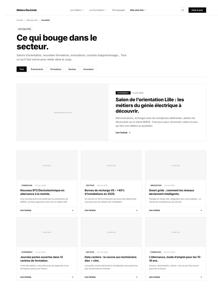
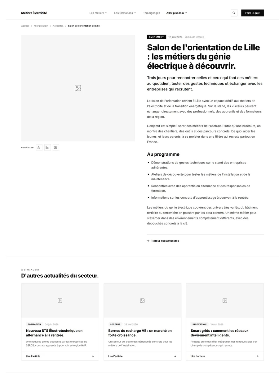
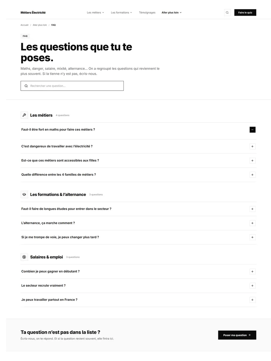
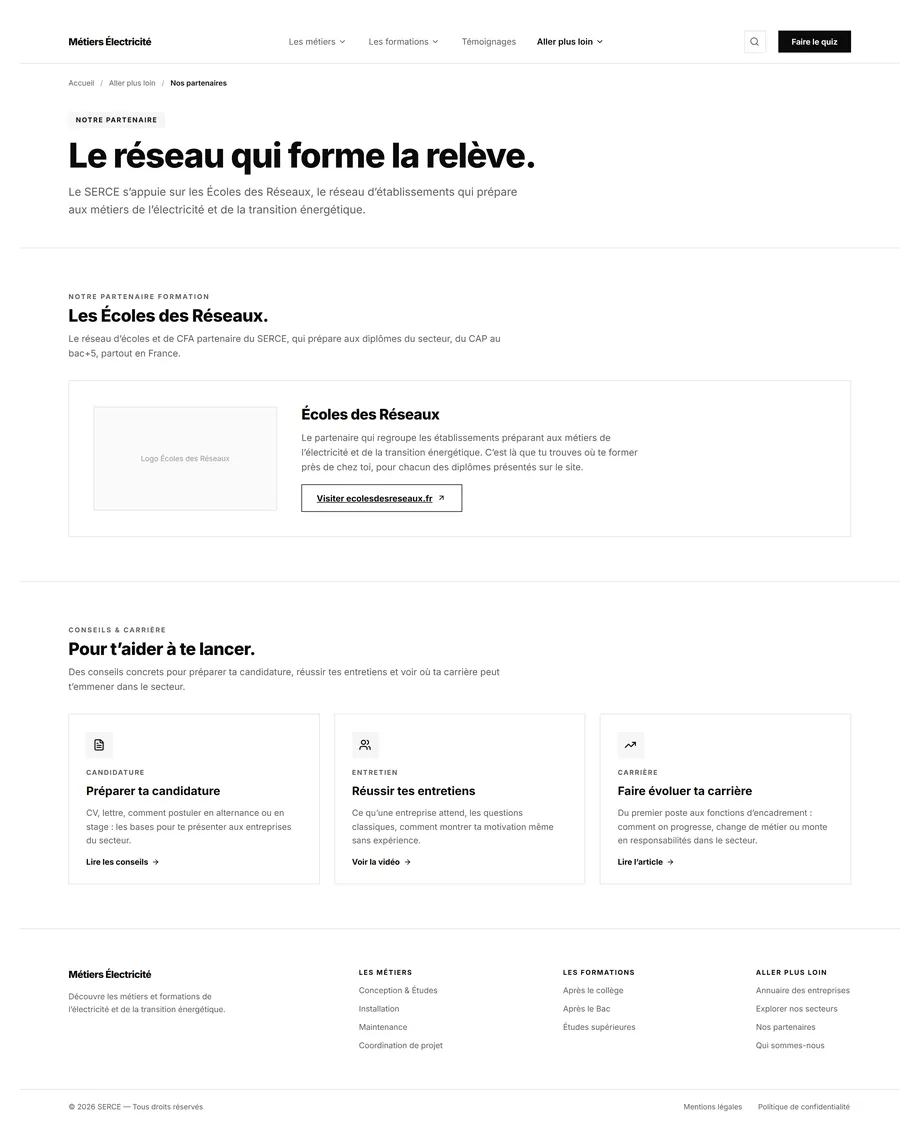
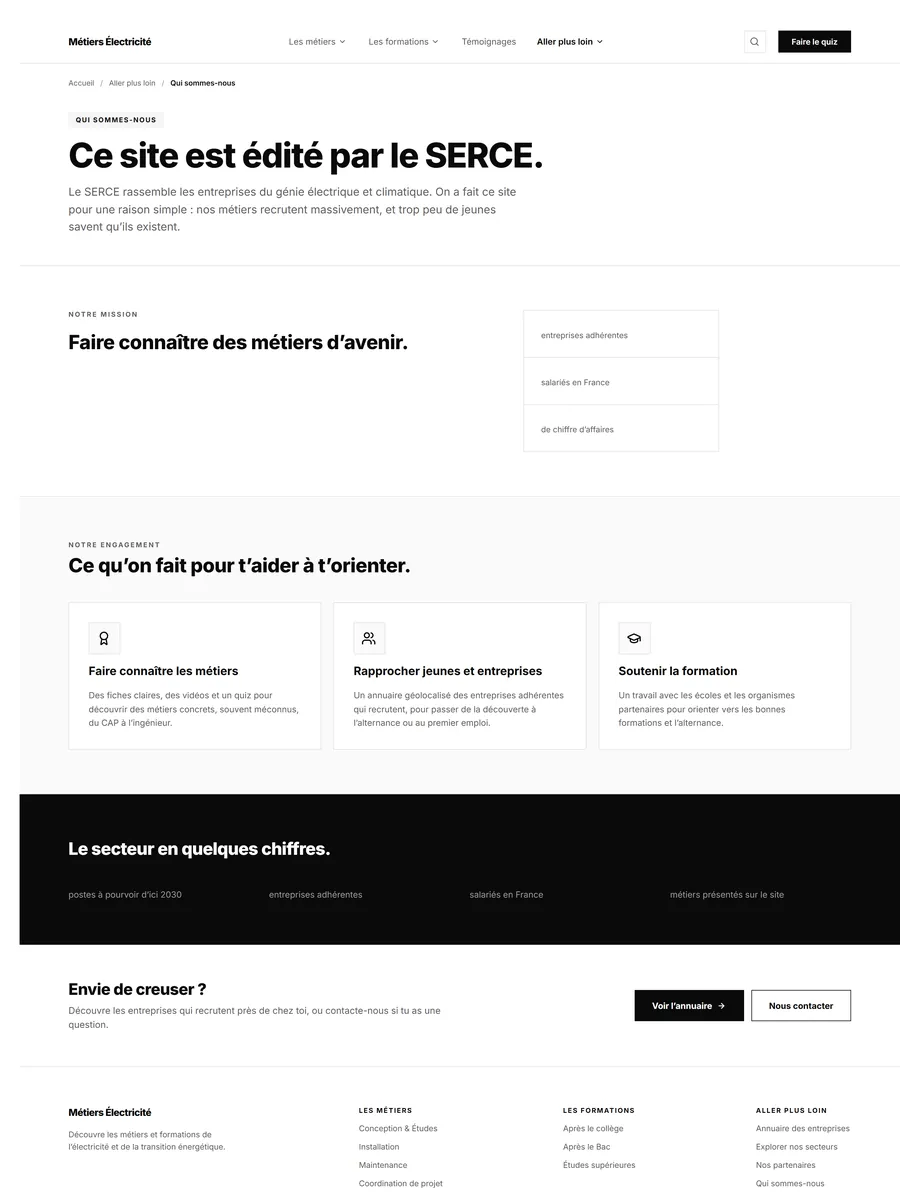
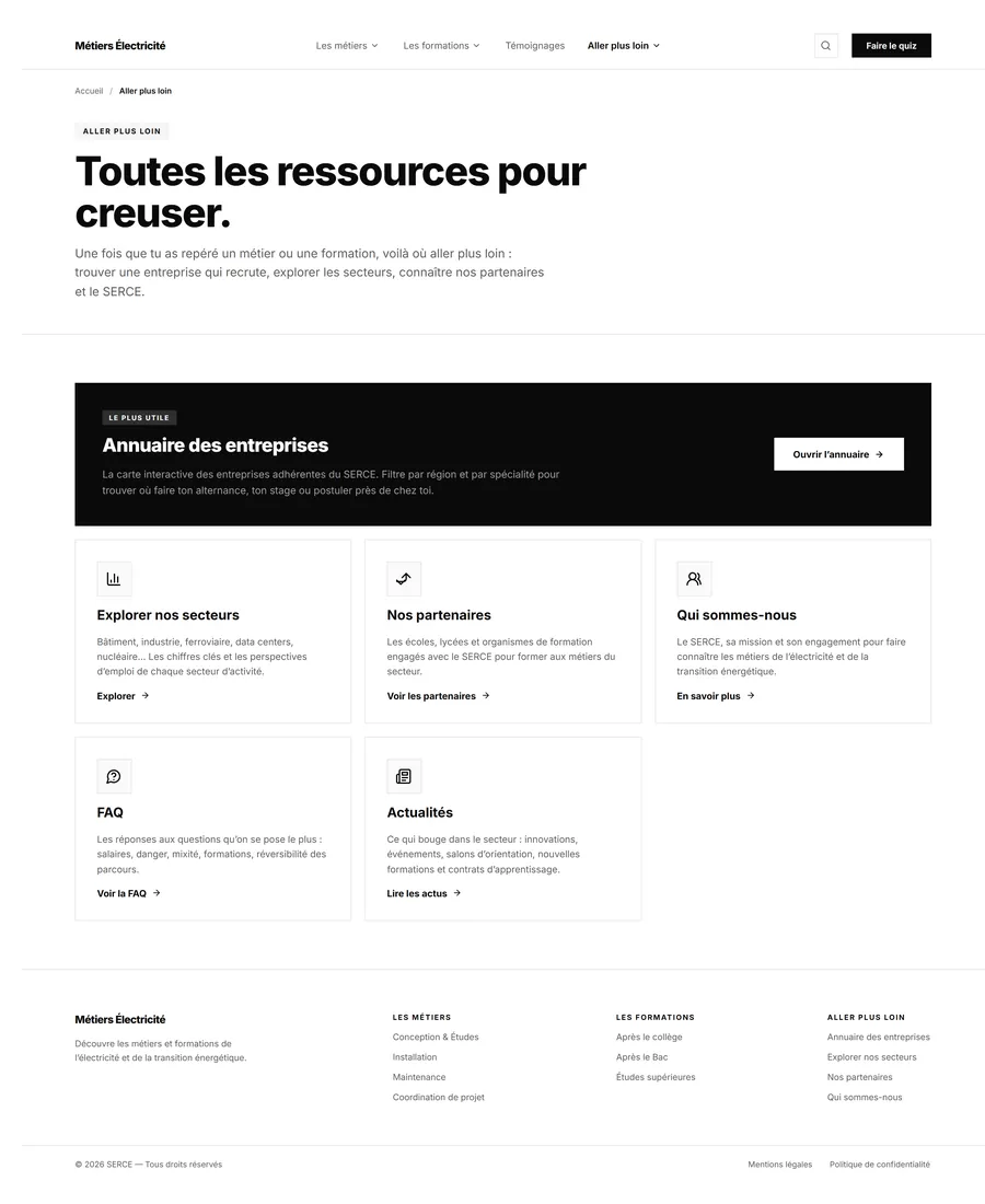
The site has thirty-seven priority pages, but it does not require thirty-seven designs. Six templates cover the essentials: the homepage, the trades hub, a family of trades, a single trade page, the courses hub and a qualification level. The remaining pages are variations on those. That logic changes how creative feedback is handled: a correction made on the templates costs six pages, the same correction made after they have been rolled out costs thirty-seven. All the sign-off effort concentrates on those six pages, before duplicating.
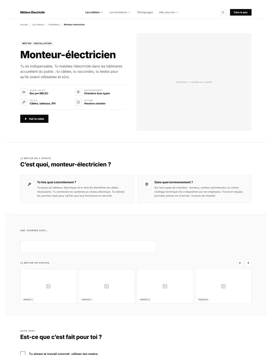
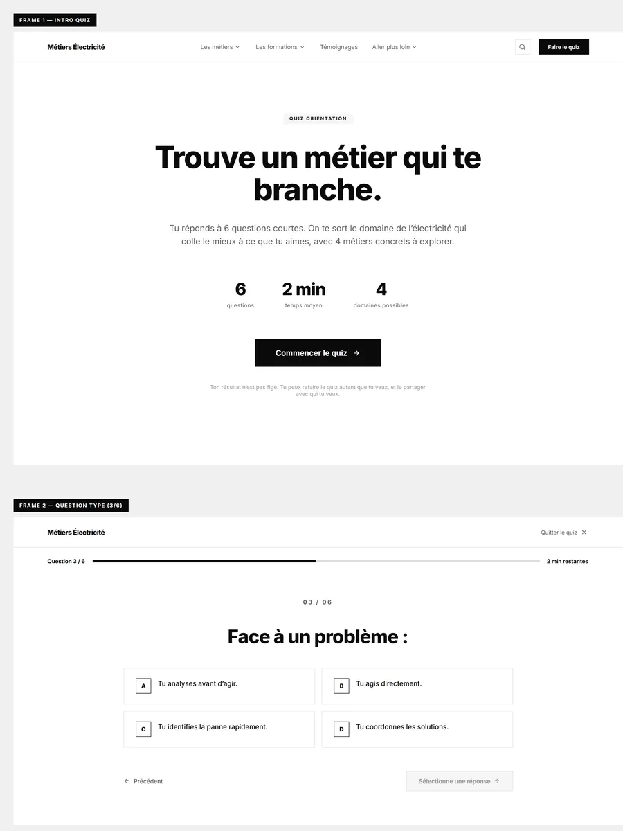
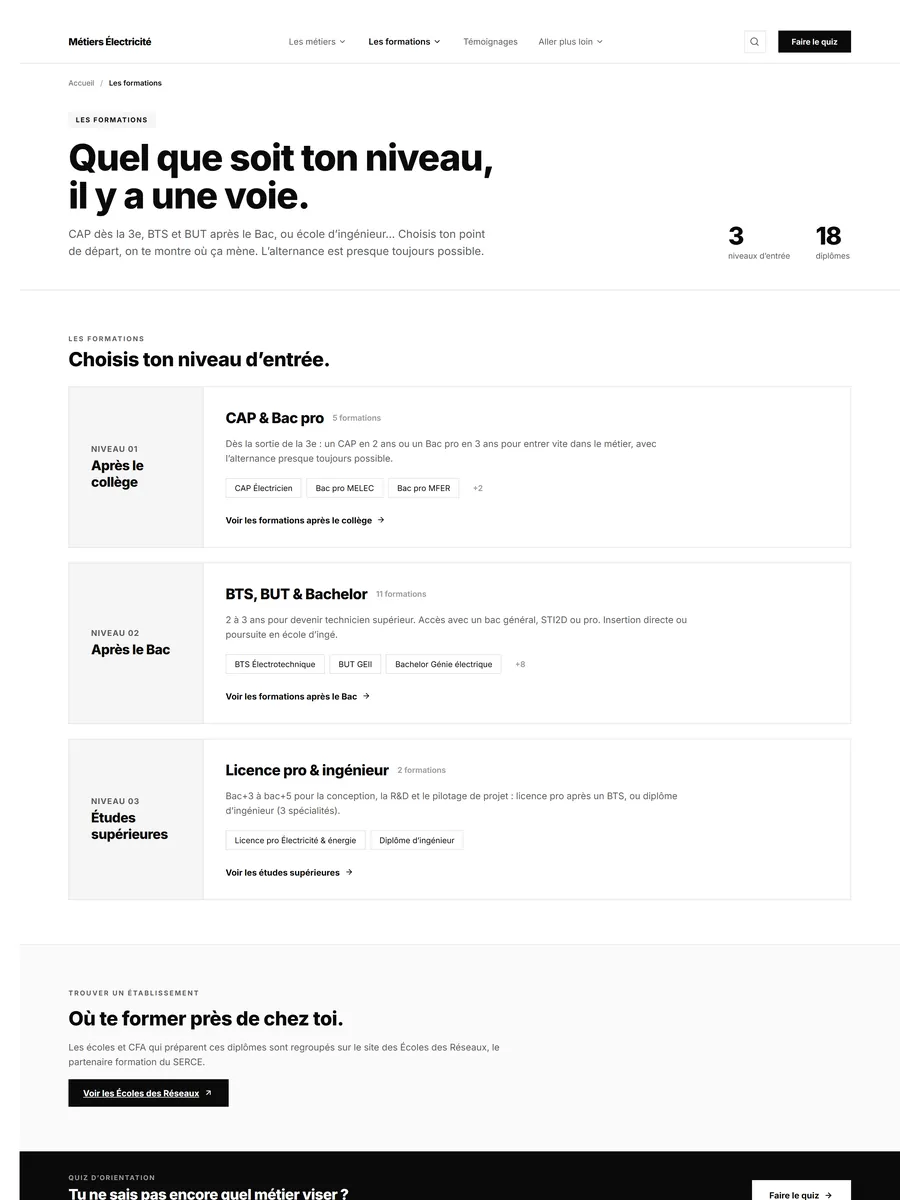
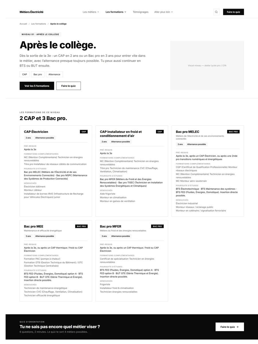
Four routes for search
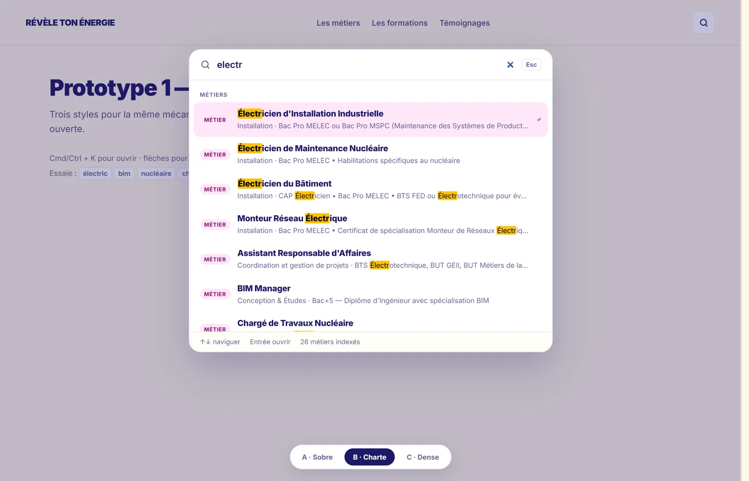
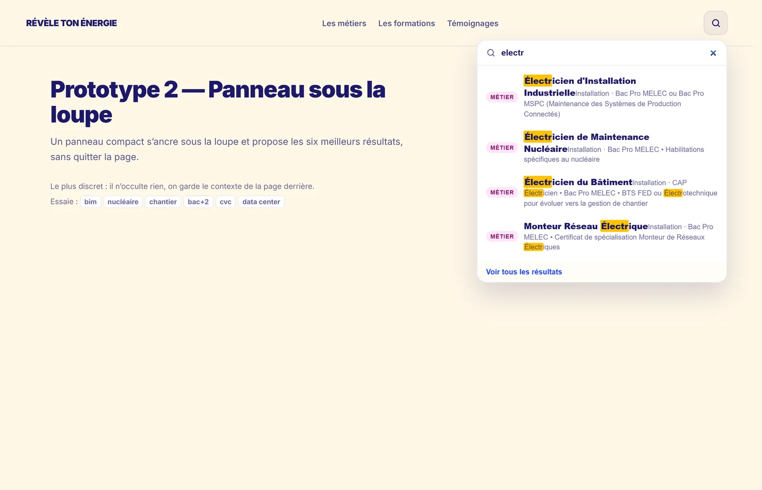
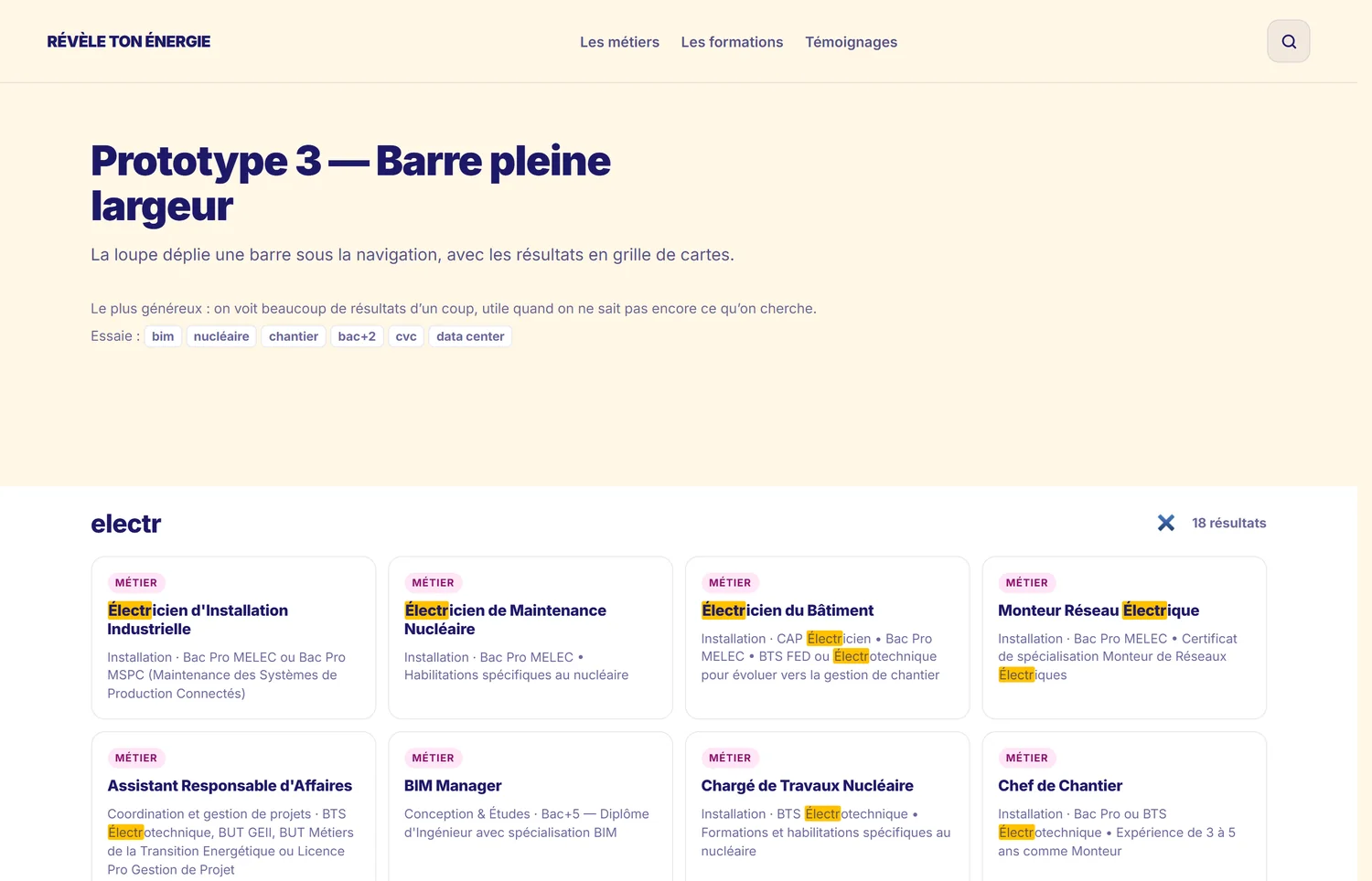
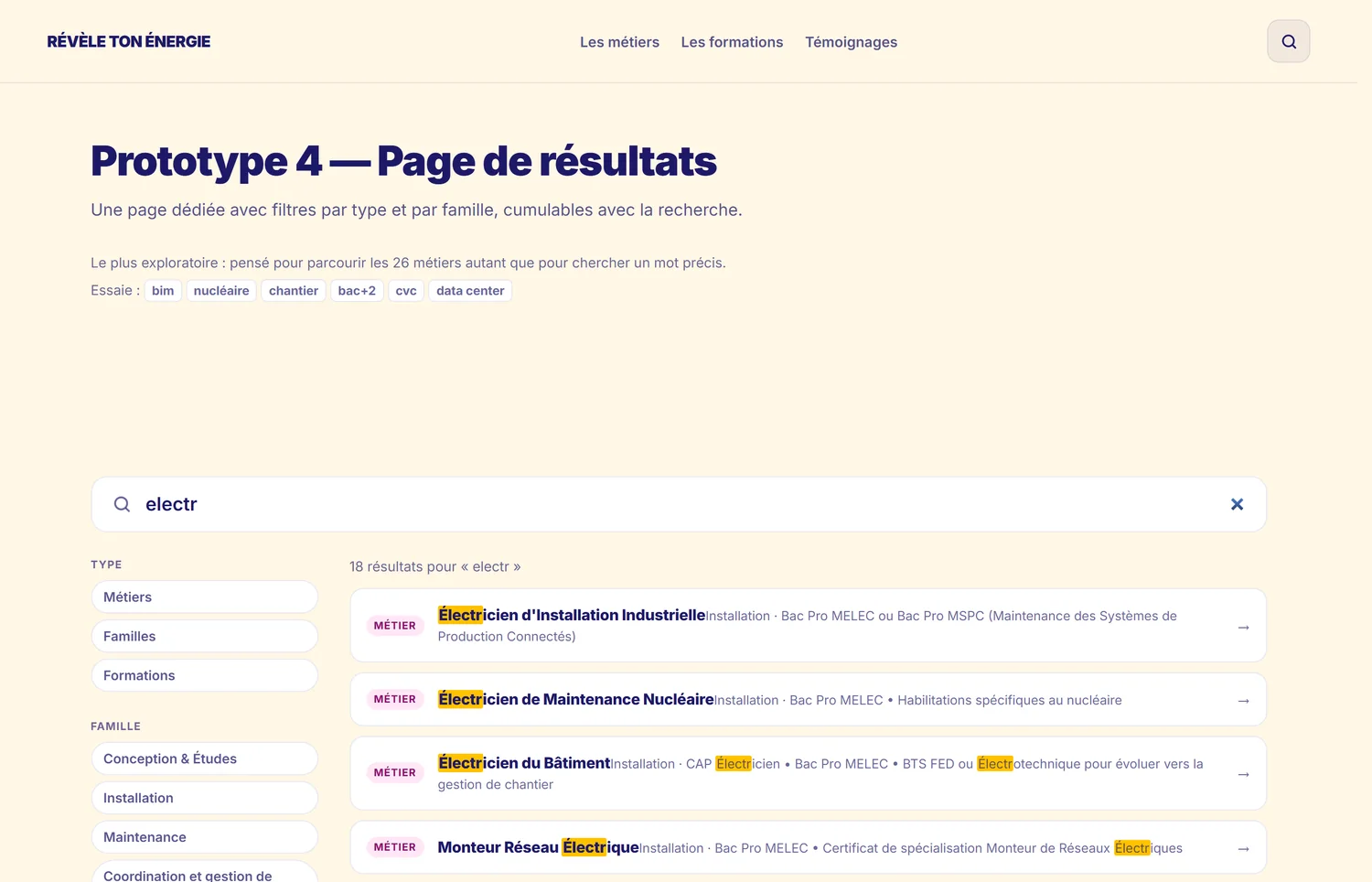
The site has thirty-seven pages and hundreds of trades and qualifications: without search, nobody finds anything. Rather than argue about it, I built four working prototypes on the same data index. A command palette opened from the keyboard, a compact panel anchored under the magnifier, a full-width bar that unfolds a grid of cards, and a results page filterable by type and by family. Each answers a different use, from the visitor who already knows what they want to the one who is exploring. Comparing them for real costs one day and settles a discussion that would have run for weeks.
The execution
The mockups are prototyped in HTML before being ported, which makes it possible to sign off the real interactions, a thread running through the page, a rub-out effect on hover, a flow of colour following the scroll, rather than describing them in a document. The site is then developed in Framer, with a staging environment the agency and the client comment on, followed by training so they can take back control of the content.
Where it stands
The priority pages are live for the new school year, ahead of the federation's communication campaign. The remaining pages follow, on the templates already signed off.