 Ilies Allali
The tool I wanted for scoping a site
A sentence in, a site’s page tree out, and a link the client understands without explanation.
On every redesign, before the mockups, I scope the structure of the site. Which pages exist, how they connect, what moves and what stays. I used to do that in generic diagram tools, heavy to maintain and awkward to share. I ended up building my own in March 2026, I use it on my client work, and it runs in production today with paid plans.
The need
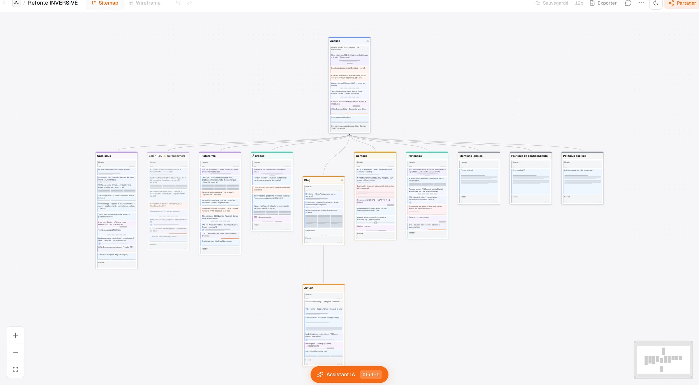
A sitemap serves two unrelated purposes. It helps me think, so it has to rearrange fast. It helps the client sign off on scope, so it has to read without a legend. Diagram tools do the first well and miss the second, because they know nothing about what a page is. What I wanted fitted in a few lines, build a site’s tree, colour each page depending on whether it is new, to be reworked or unchanged, and send the whole thing as one link. What you see here is a real project, the Inversive redesign, with each page’s content annotated on it.
Starting from a sentence
A project starts by describing the site in one sentence, and the AI returns a full tree with page types and descriptions. It is not a demo gimmick, it removes the setup hour that used to put me off opening the tool at all. What matters is what comes next, everything stays editable by hand. A generated tree is a first draft, never a deliverable, and the interface is built so you correct it rather than accept it.

The wireframe in the same place
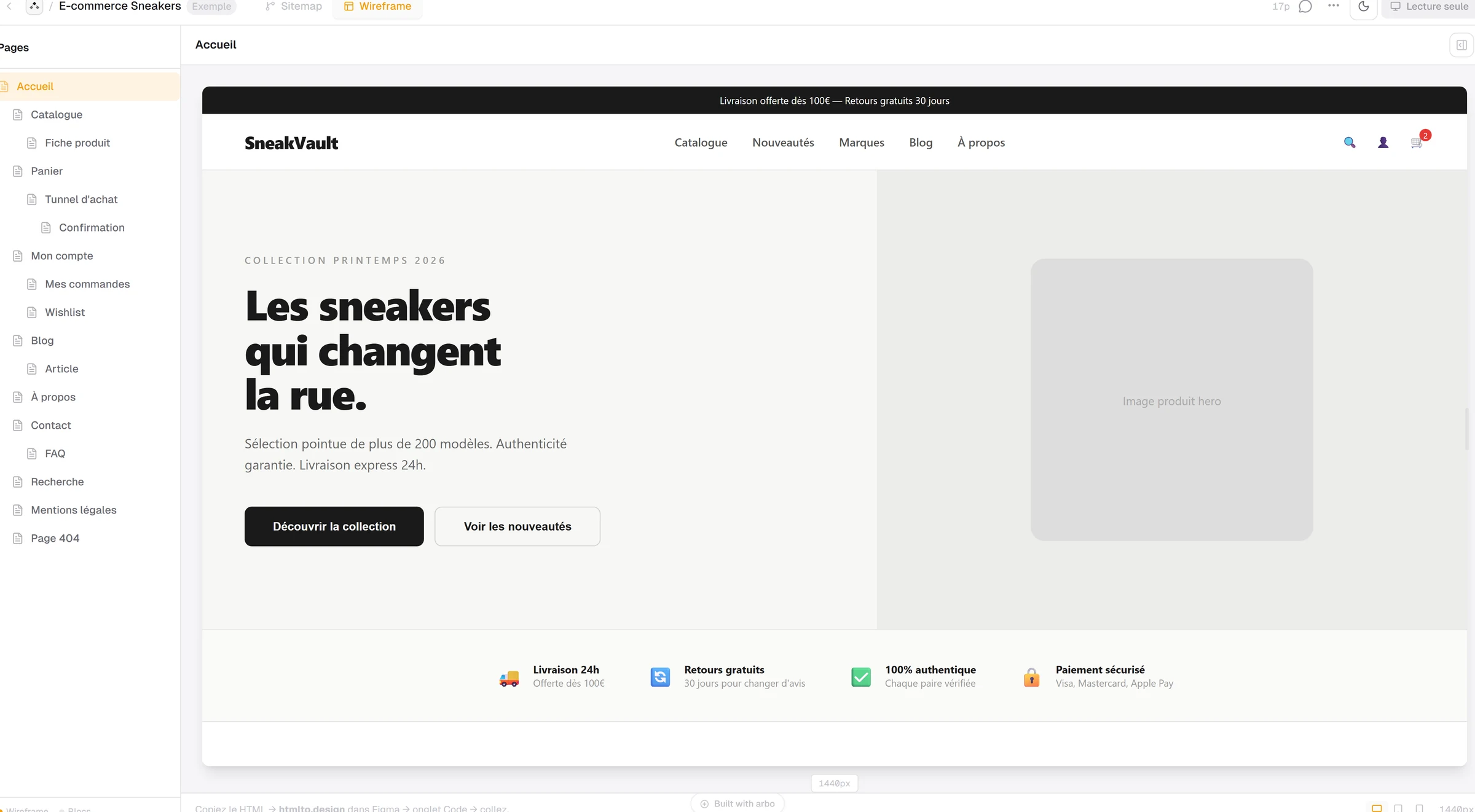
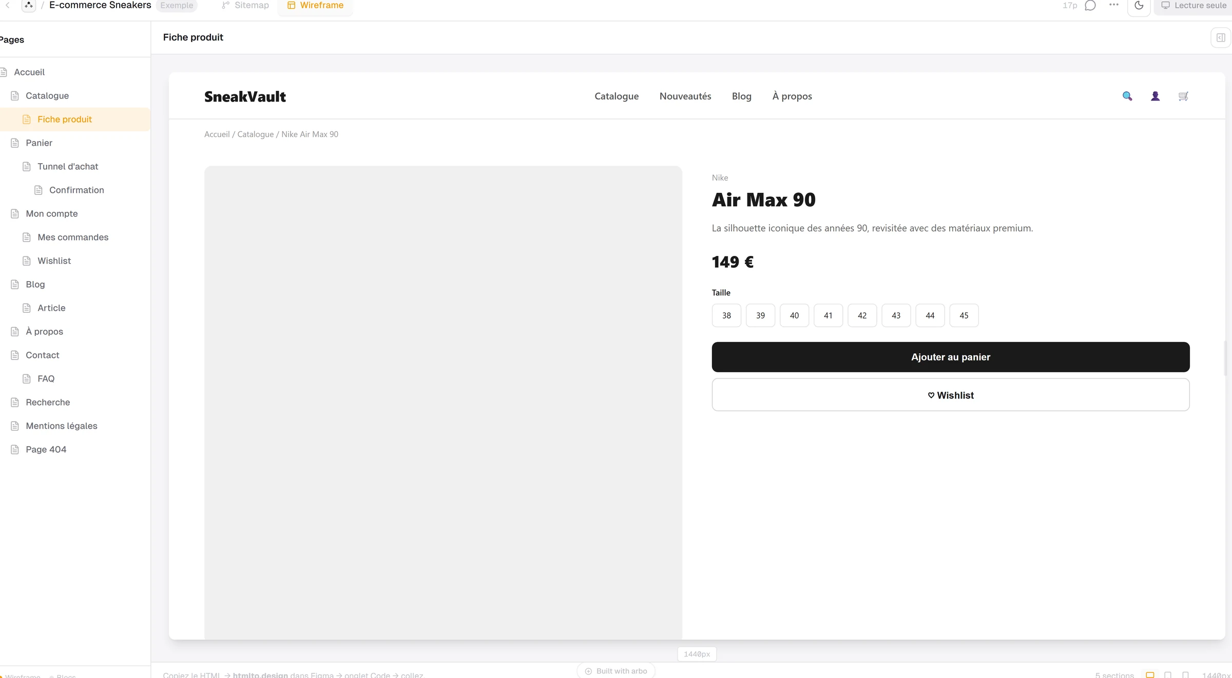
Each page carries its own lo-fi wireframe, inside the same project as the tree. Header and footer are detected as global components, so one correction propagates instead of being redone thirteen times. The HTML pastes into an import tool and lands in Figma with its layers, which removes the manual cleanup I used to do. At this stage I do not want aesthetics, I want the client to argue about structure without mistaking a grey block for a design proposal.
Pricing, and what it forces you to design
Comparable tools rent for around fifteen dollars a month, for something you use per project and leave idle in between. I went for a one-time purchase, no subscription. That immediately costs the recurring revenue that would fund the AI, which is why the tool accepts an AI provider key of your own, or a connection from an MCP client. The model spend belongs to whoever incurs it, and the credits sold inside the app are only a ramp for people who would rather not manage a key. The pricing decision shaped the architecture, not the other way round.
Building it alone, and what that imposes
My work on this project is product scoping, interface decisions and art direction. Architecture, database and deployment I delegate to a coding AI and review. That changes what is reasonable to start, and it forces simplicity. The app runs on a single-file SQLite database, deployed in Docker on my own server. It is a deliberate choice that rules out spreading load across machines, and in exchange it fits in one command, backs up by copying a file, and costs nothing when nobody is using it.
From a personal tool to a product
At first it was for me. I used it on real client work, clients asked for the link, and I added paid plans with payments and licences. It is the same path as my Framer plugins, where I solved my own problem before turning it into a product. What I take from it goes beyond Arbo, when I need a tool that does not exist, I look at what it would cost to build before looking for a workaround.